Maps and Stacks
[2019]
Maps and Stacks [2019] Tribeca, New York
Exhibition Content
[2019]]
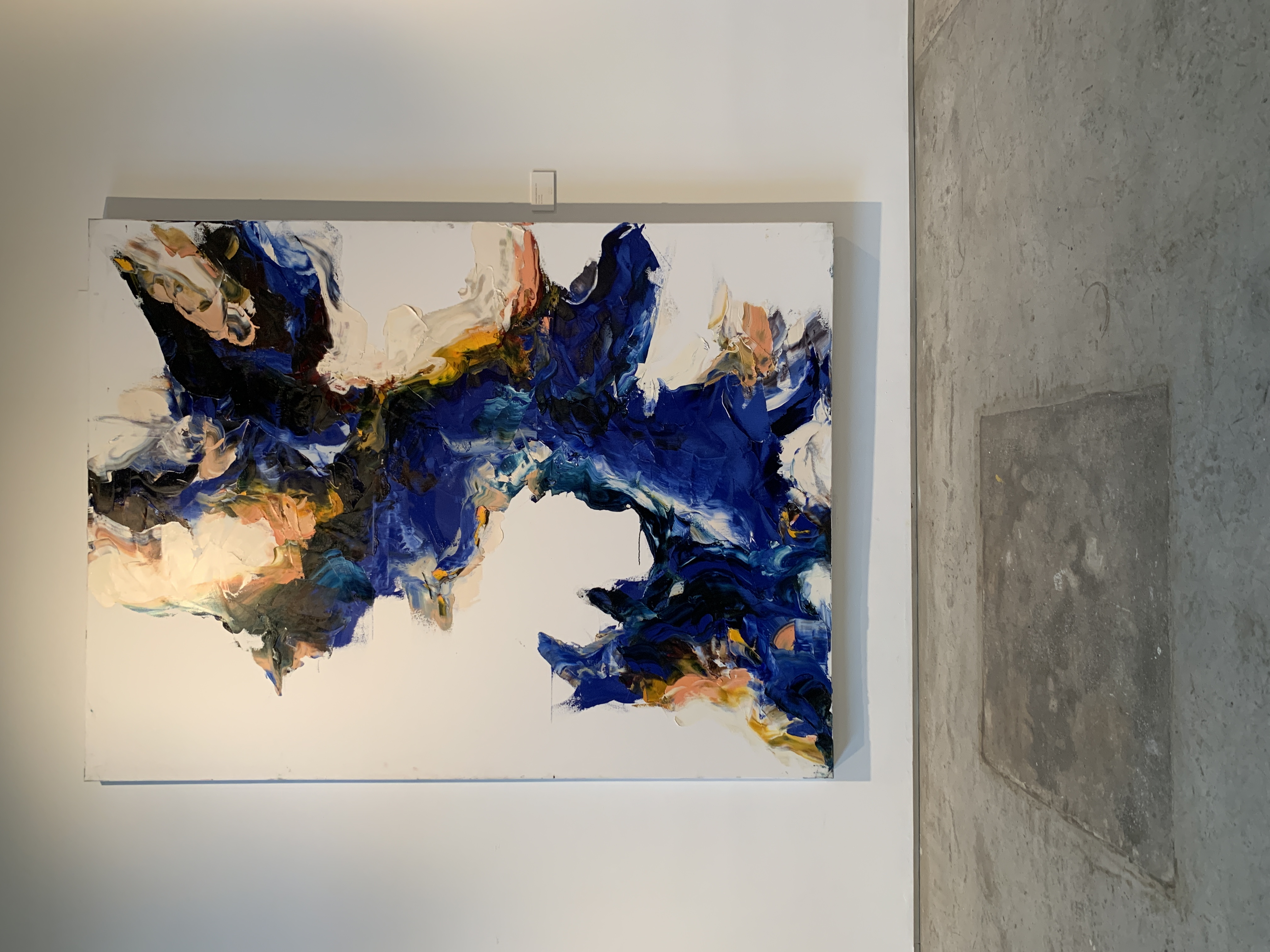
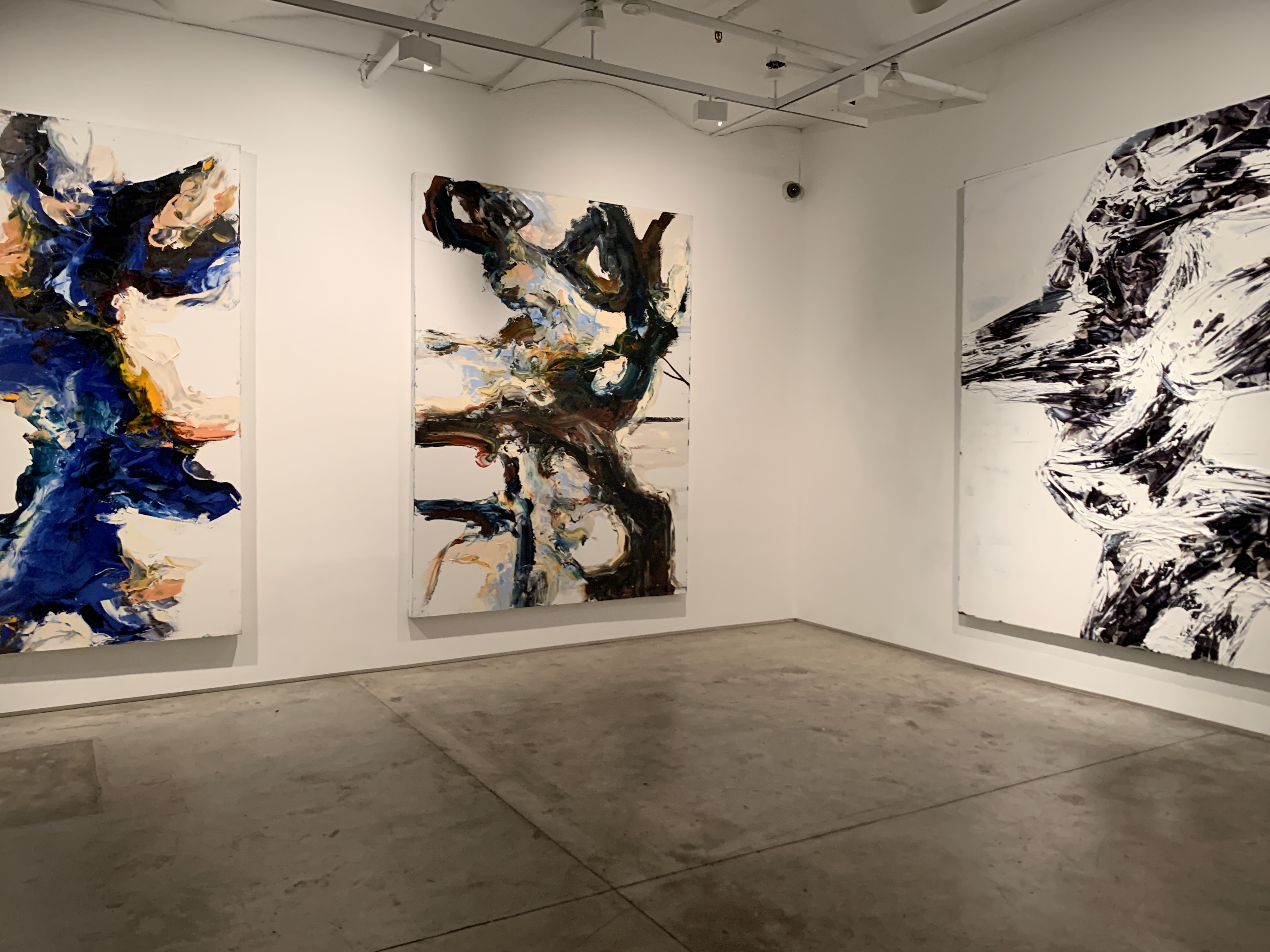
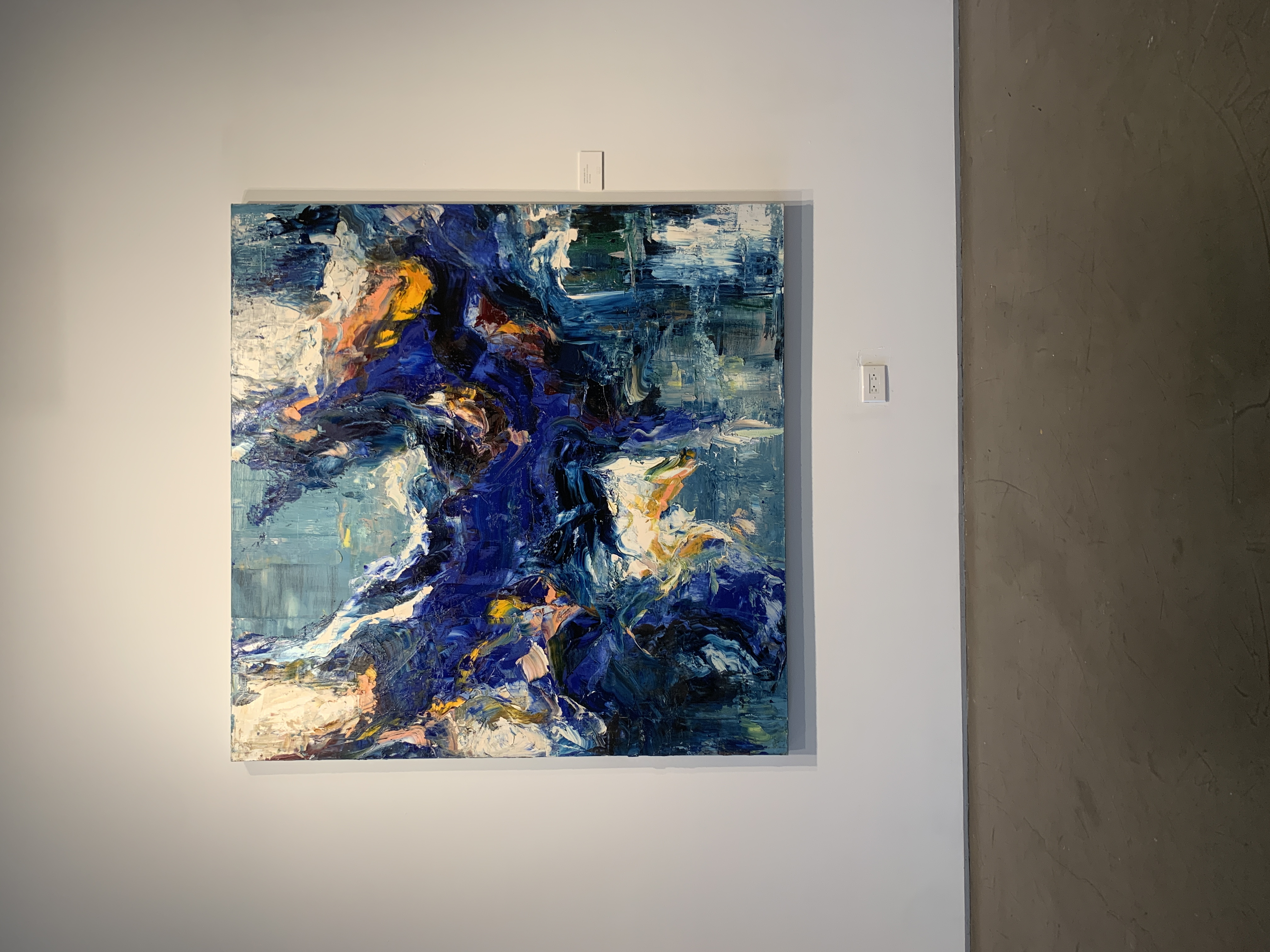
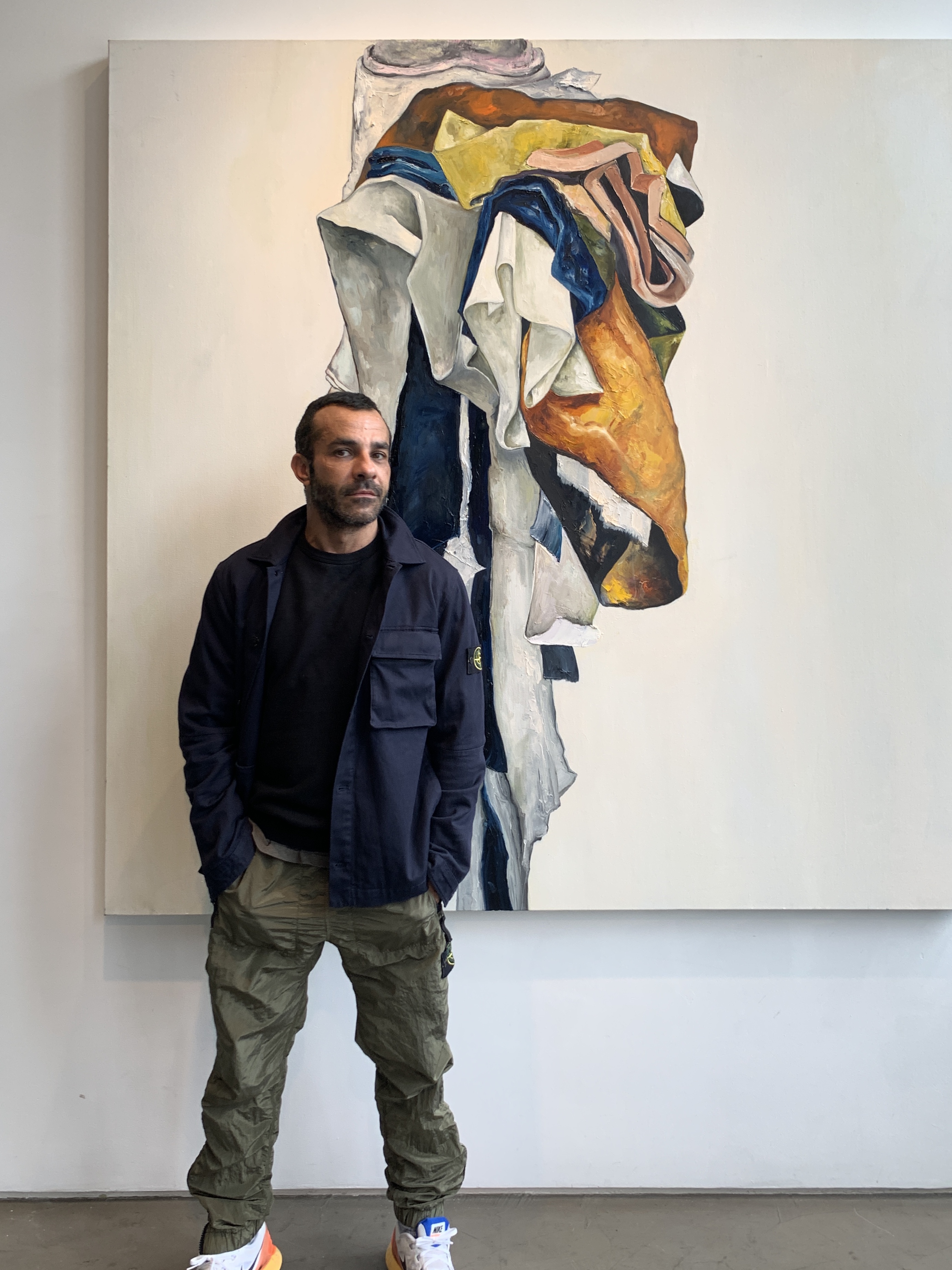
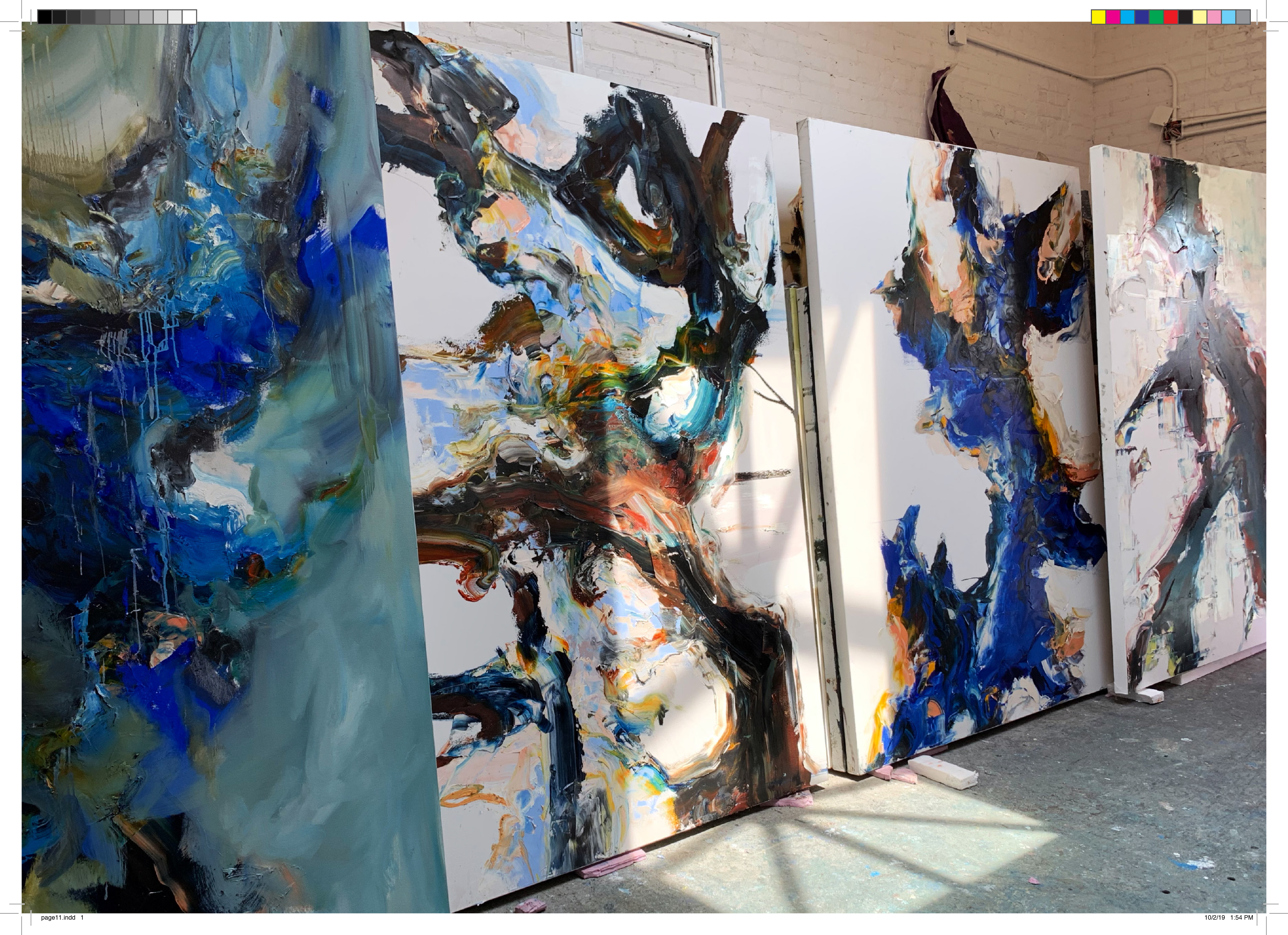
New York, New York, October 16, 2019 -- On Thursday evening, Michael Angel’s second solo art exhibition, Maps and Stacks, opened in New York. Set in a two-story Tribeca gallery, the large scale mixed media works garnered praise from new and old collectors, art critics, as well as friends and design-world colleagues.
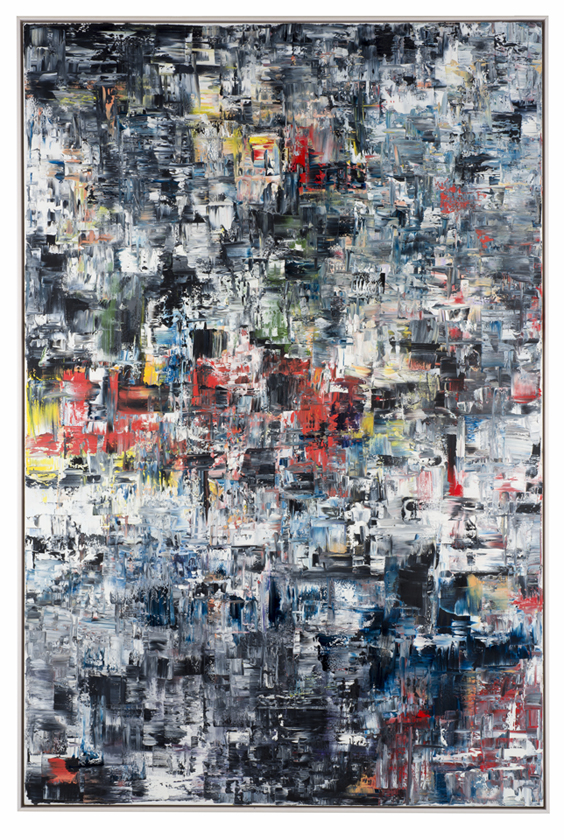
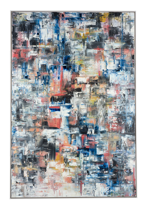
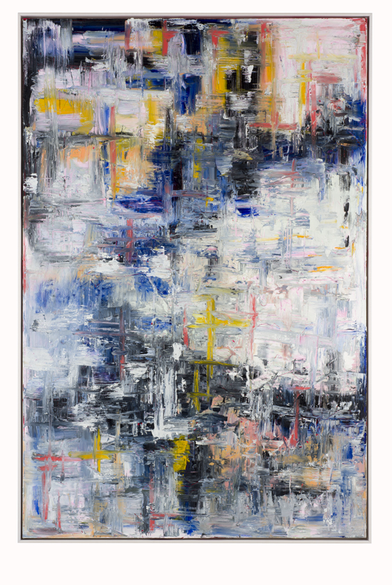
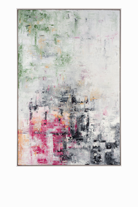
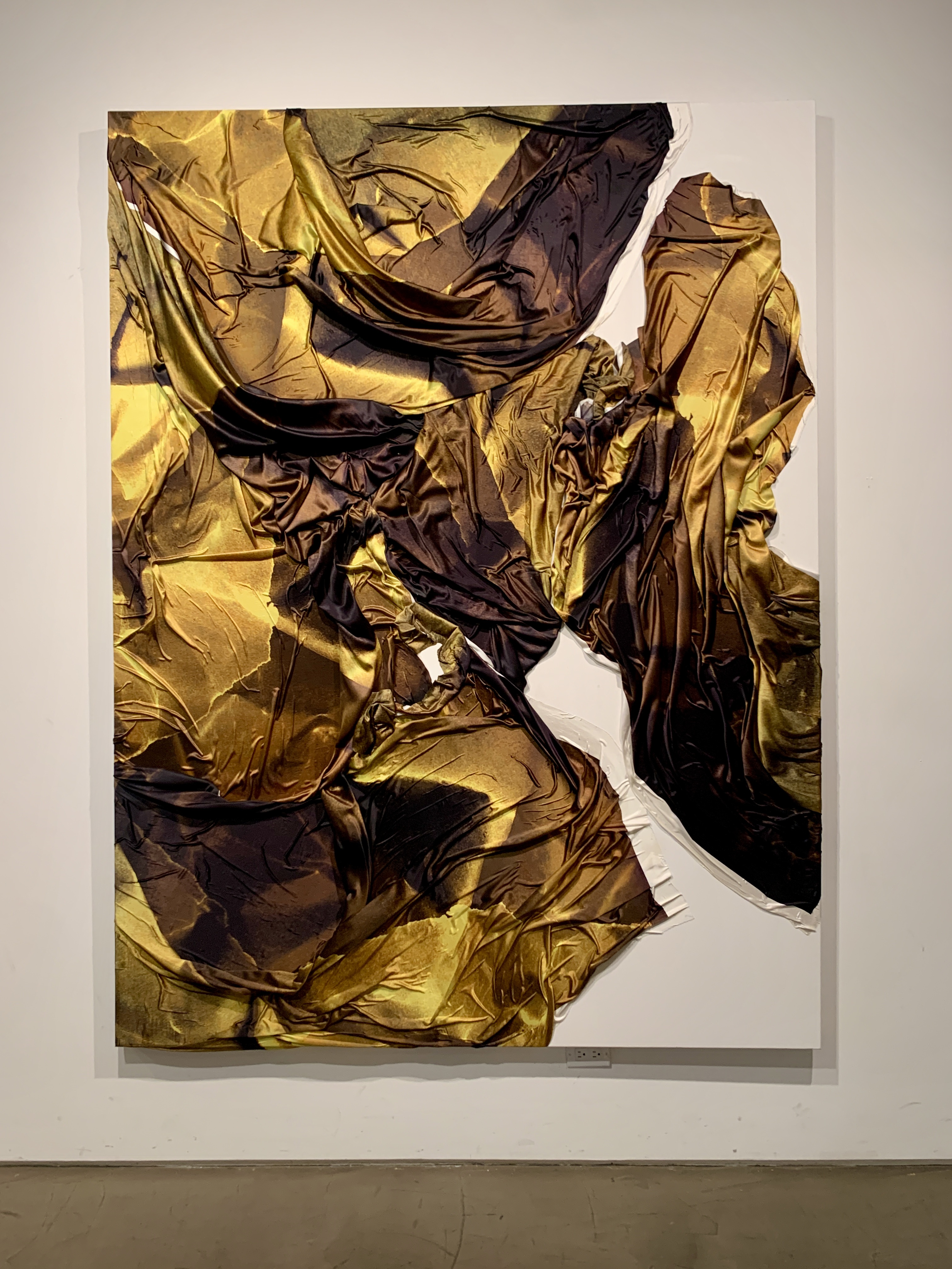
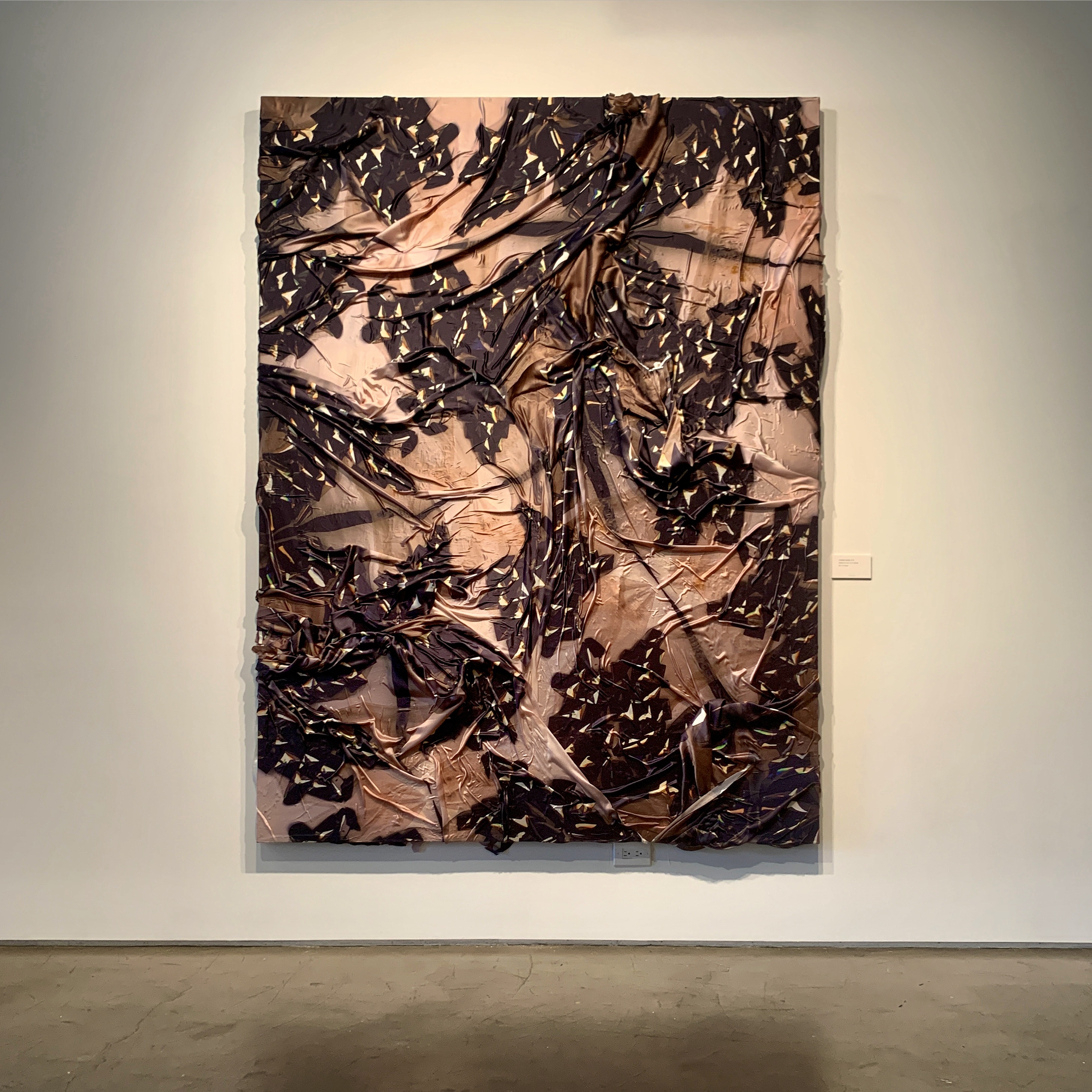
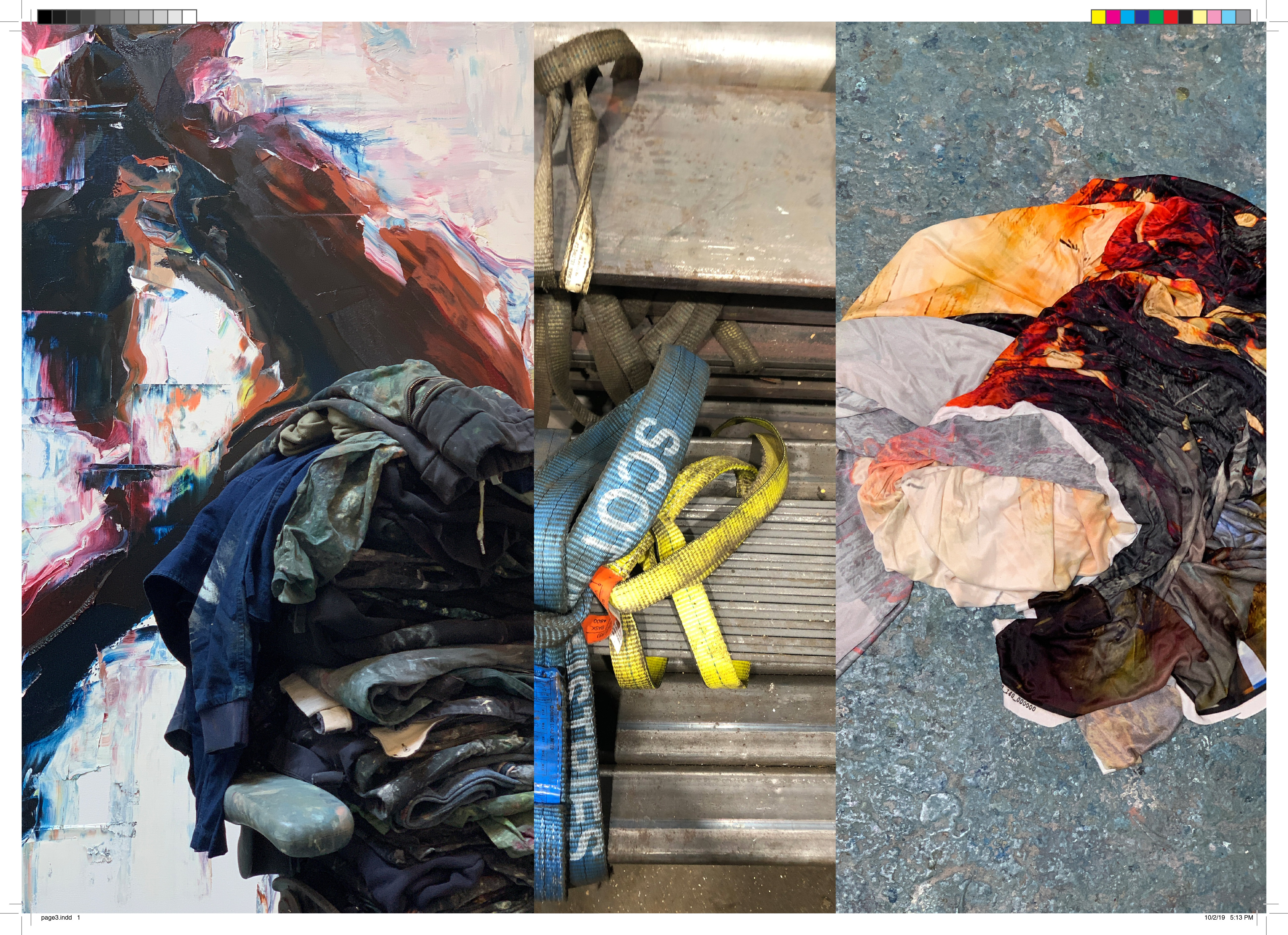
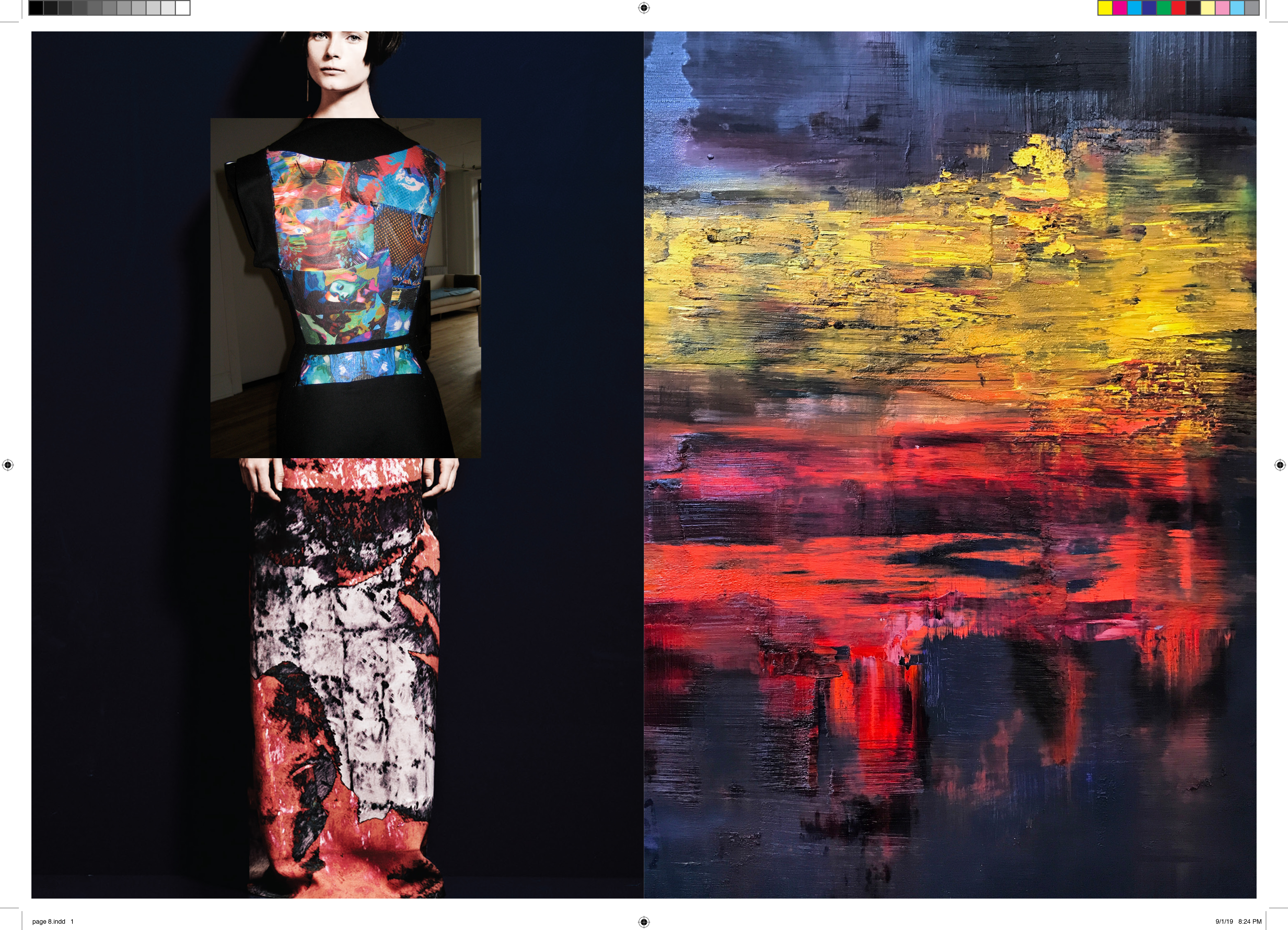
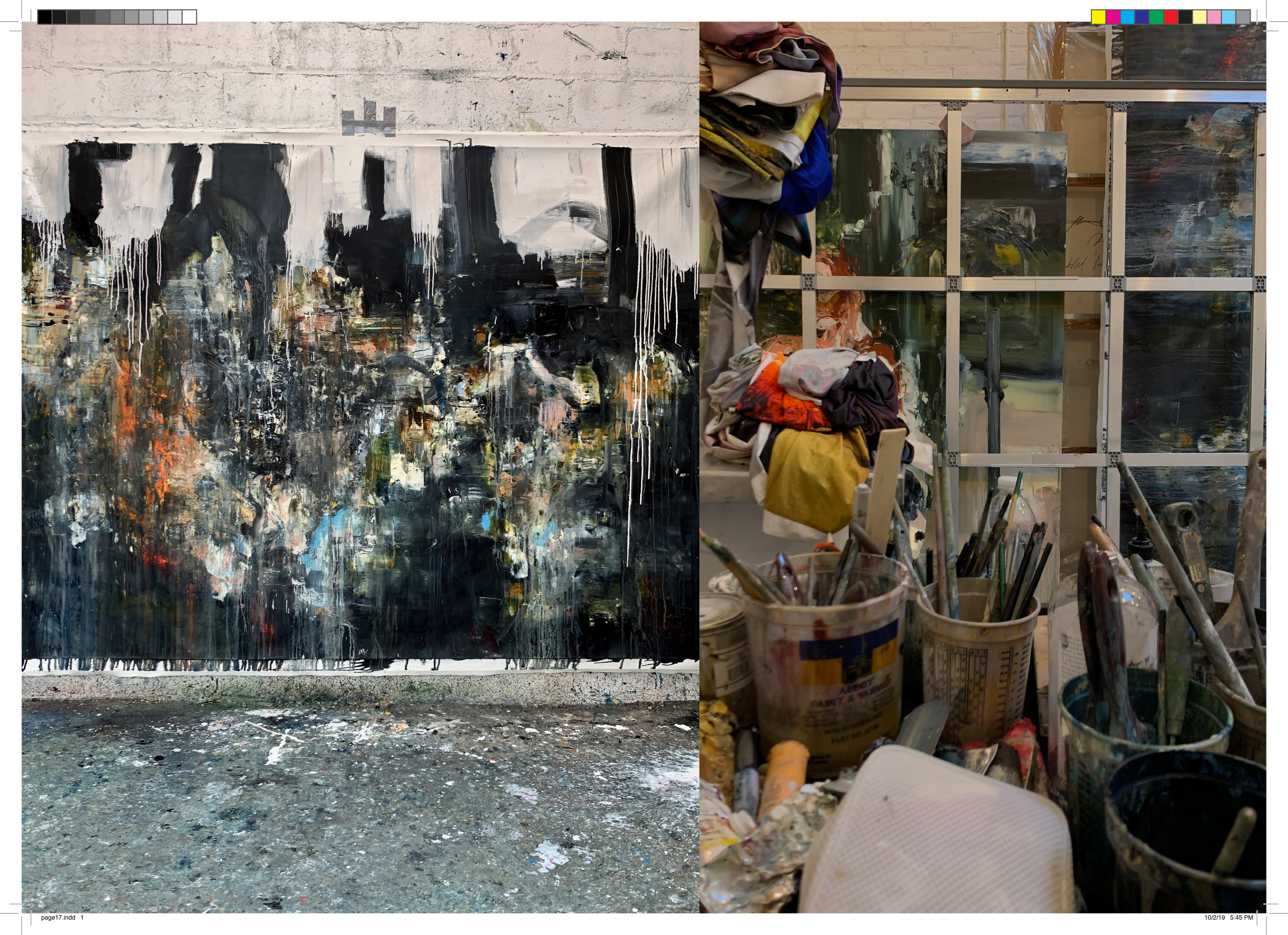
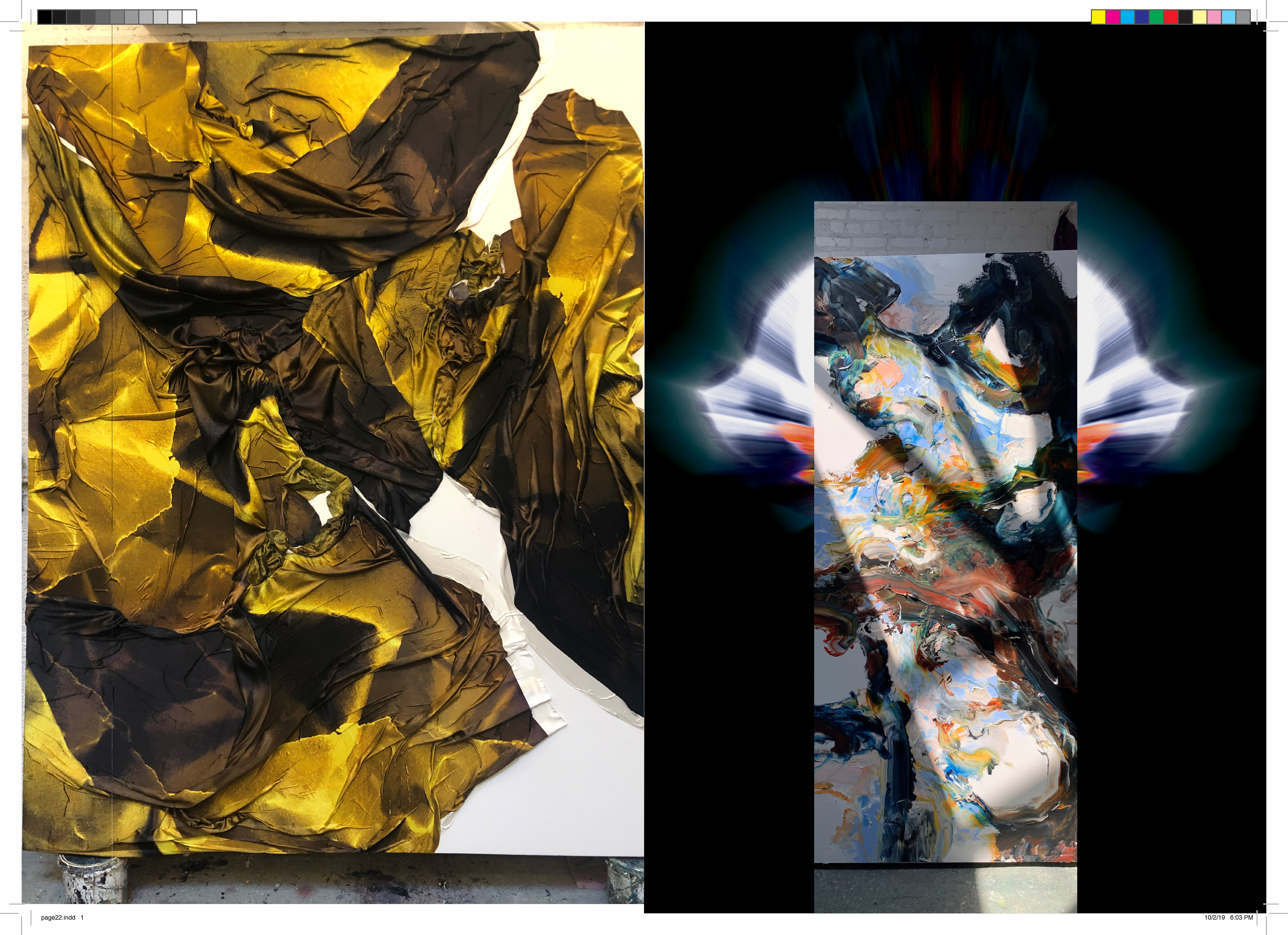
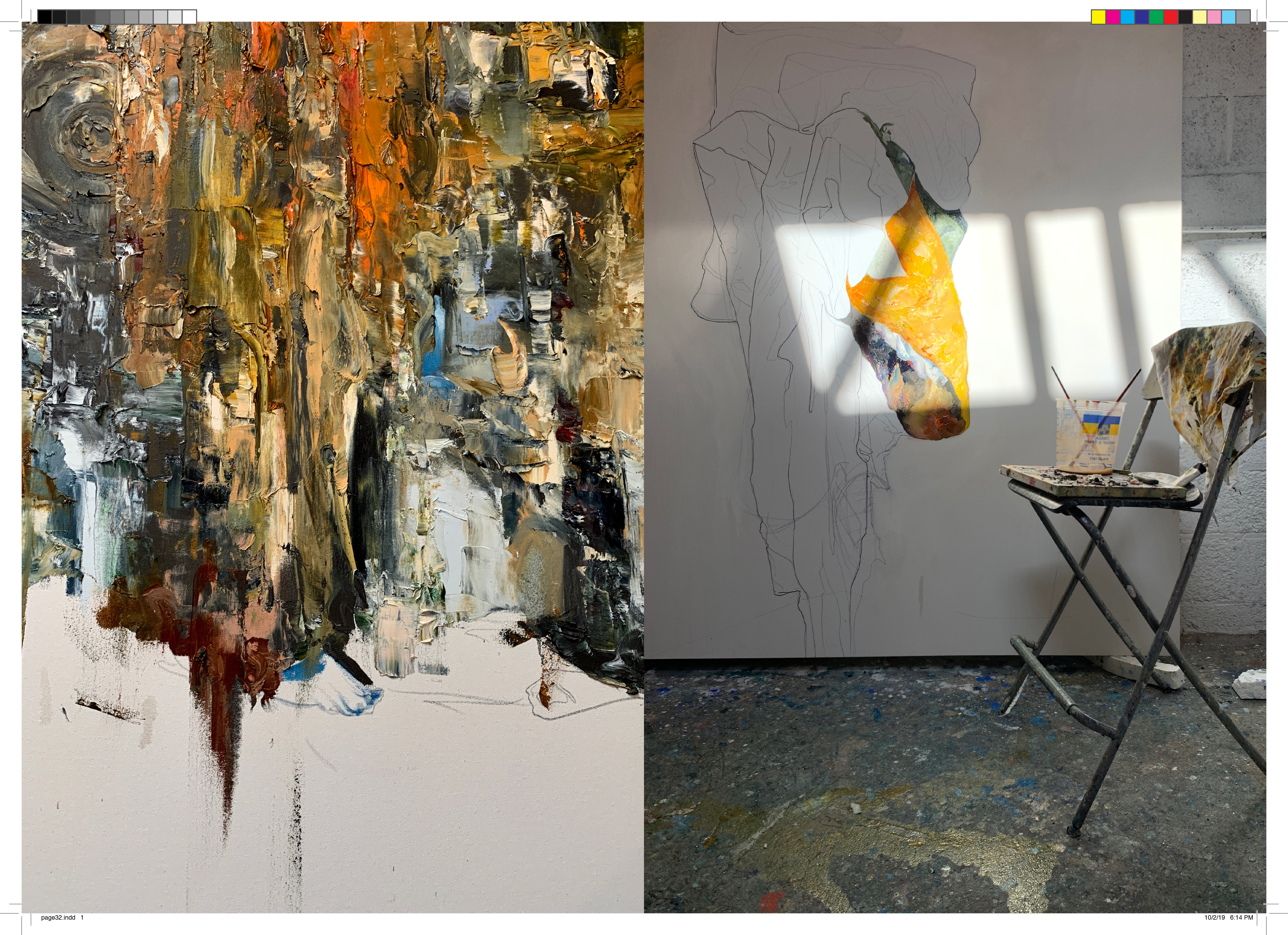
Angel’s museum-exhibited, hand drawn digital prints on fabrics, including expertly blended silks and wools he used as a designer, remain the medium of choice. Though now, his 10+ year archive of textiles serve as the top coat in a layered abstract expressionist painting on canvas, created through gestural movements in a style all his own.
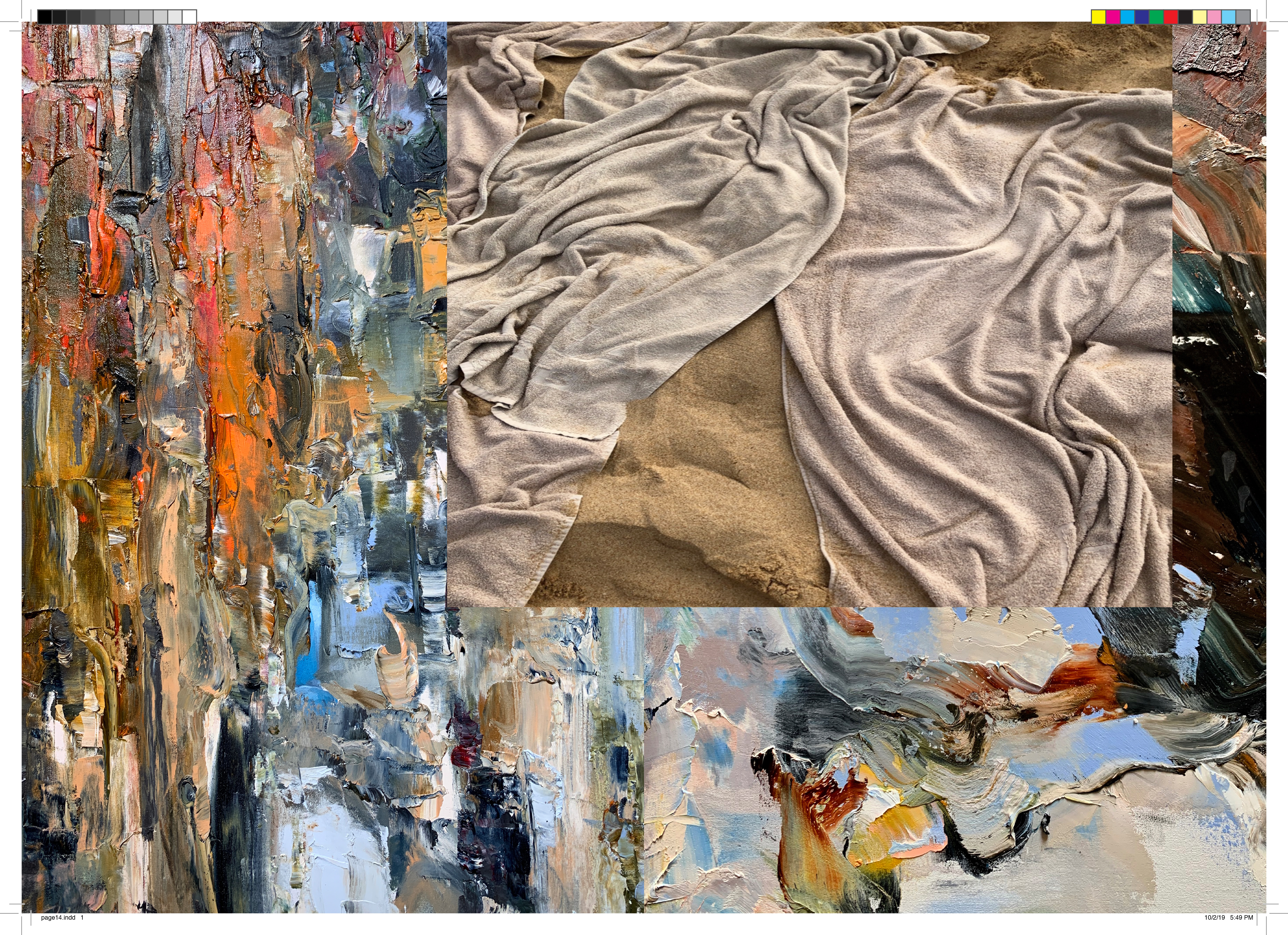
Examining empathy, the universal emotive language, Angel’s mixed media works fold and crease, captured colors and cloth physically merging into piles of materialized movement, which distantly call to mind Sam Gilliam’s draped paintings and Katharina Grosse’s painted fabrics. For the innovative textile artist, material is also the subject, which summons a reevaluation of materiality and what it means “to paint.”
“My love of painting and art was inspired by the Great Masters’ treatment of cloth. This is an expansion upon the language of my work,” Angel says, “prompting the viewer to explore a process of merging, even in our most fragile and naive states [while] also showcasing both difference and harmony.” Maps and Stacks was curated by Steven Sergiovanni for Gobbi Fine Art, and will be on view until October 21st, 2019.
Maps and Stacks communicates differences and the ability to understand and share someone else’s feelings: How they merge, even in our most fragile and naive state.
In his latest series Maps and Stacks, Michael Angel examines empathy - a universal emotive language that is constantly evolving, and now, taking form through his art.
Angel’s textures fold and crease, colors merge and cloth physically piles into a materialized movement captured in his compositions. His use of multimedia allows us to experience a literal and figurative narrative through the movement and pressure subconsciously applied. The use of the seemingly opposing mediums of cloth and paint showcase both difference and harmony, and help tell a story about our own ability to understand and share someone else’s feelings.
Angel’s deliberate intrusion and his treatment of space, color and texture are meant to displace us. This weight is seen transferring from piece to piece inviting the viewer to take part in this aesthetic conversation to understand one another's feelings along with the artist's.
Q&A
What is the meaning behind the exhibition title, or the curation of these works?
Maps and Stacks is a language about empathy.
How have your works have evolved over the past 10 years (designer to artist)?
Since my earliest memories, I have drawn and painted. I have always been fascinated by the early works of the Great Masters. The intrigue of the cloth fold in paintings or sculptures propelled me into a lifelong study of this medium and its forms. This eventually led me to creating my own textiles based on my original artwork. After a decade in fashion design, I chose to focus solely on painting when the industry began to over commercialize digital print design and made it no longer special to me.
Over the past 2-3 years (specifically your artwork)... materials, inspiration, intention, etc.
Over the past 2-3 years, I began to incorporate the textiles of my Past as a natural extension of the media I was using at the time. This is the essence of the Maps and Stacksseries. As a painter, the use of this medium enables me to further explores the perspective of the storytelling and expand the dialogue of painting.
How is the creation process similar, if at all, to designing?
The process is very different. When you are designing, you are doing it for people to actually wear. Fashion is first about practicality. Art is a more personal and instinctual process intended to illustrate a narrative.
How do you feel your art contributes to current conversations in art and the contemporary landscape?
This show is really about empathy. The timing of this series is extremely relevant to where we are today given the current social environment. Maps and Stacks was driven by my surroundings: empathy became prominent because of the lack thereof. I am using these mediums because of their fragility and vulnerability. The medium that I use are very relevant to the discussion of contemporary art today but for me they have always been part of my work.
Which artists, classic or contemporary inspire and interest you? *Can we draw any similarities to your work?
My first love was with the Great Masters and their treatment of the cloth. Later I became drawn to the Abstract Expressionist movement. I have been inspired by various artists throughout my life and admire many of them. When I think of myself, I prefer not to associate with any movement or category, at least not for now… Maybe it’s related to my issues with commitment… except the commitment to my instincts.
Who (or what) is your muse?
My muse is my curiosity.
What is most exciting about your work right now? What's most exciting in the art world right now?
The most exciting thing about my work is the process and the discovery of new techniques. Also the response that I am getting has been very encouraging and positive. The art world right is exciting right now because of its current diversity and acceptance of all types of artists.
What will you do/work on next?
Expanding the language of my art.
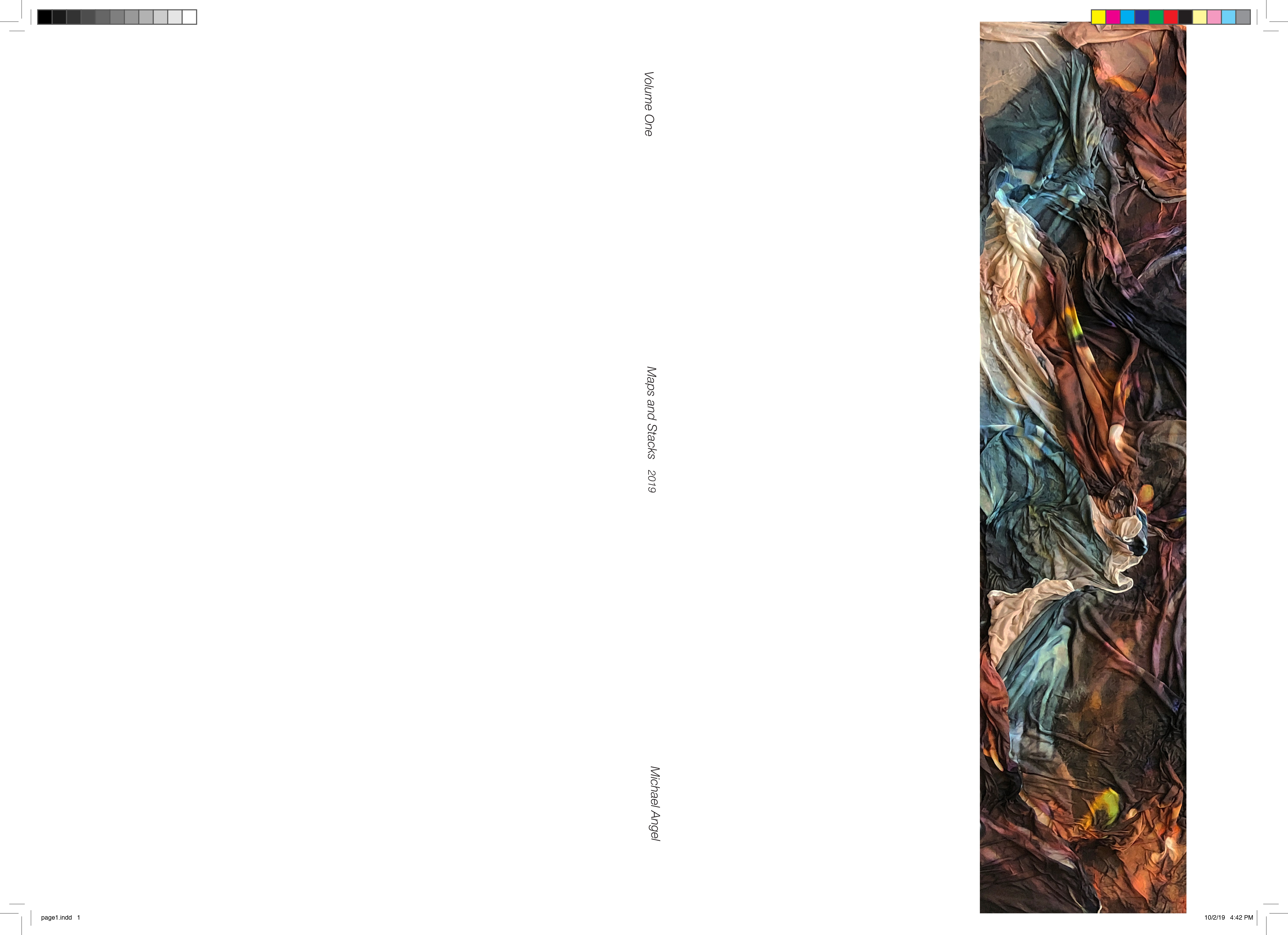
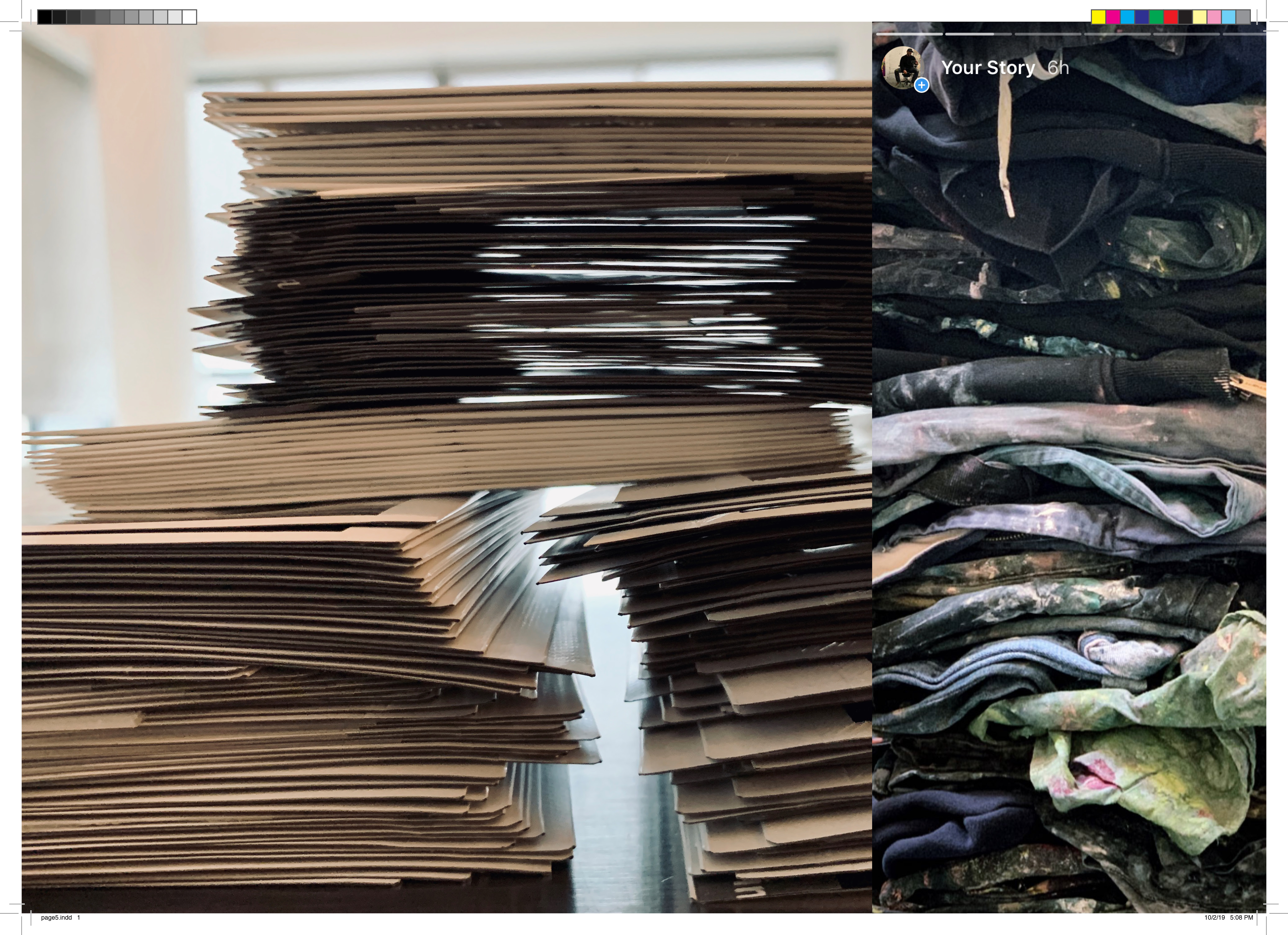
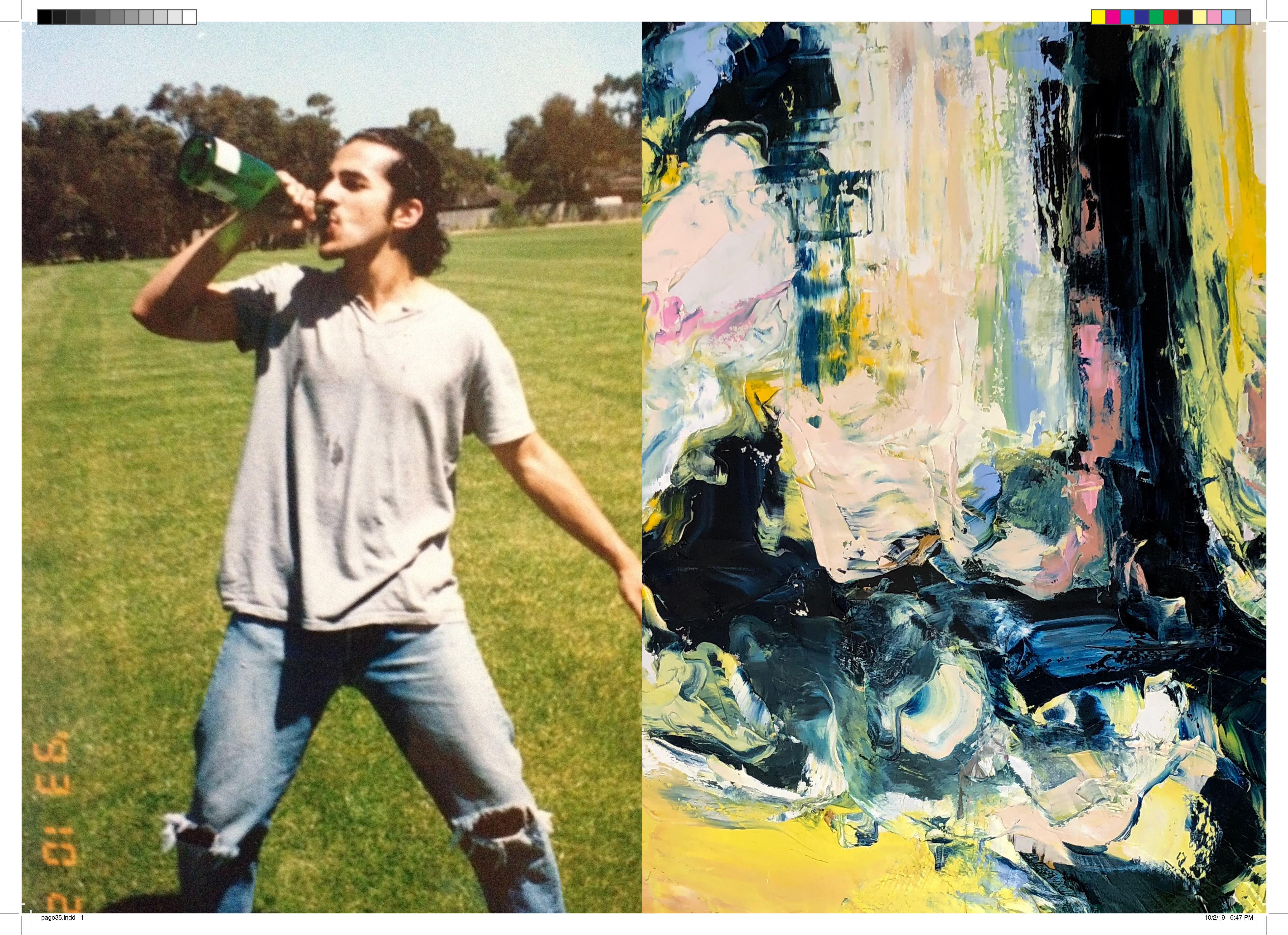
In additon tot he show, Angel produced his first Zine in support of the show. Titled Volume 1, 2019.






Home
[2018]
Home [2018] Tribeca, New York
Exhibition Content
[2018]]
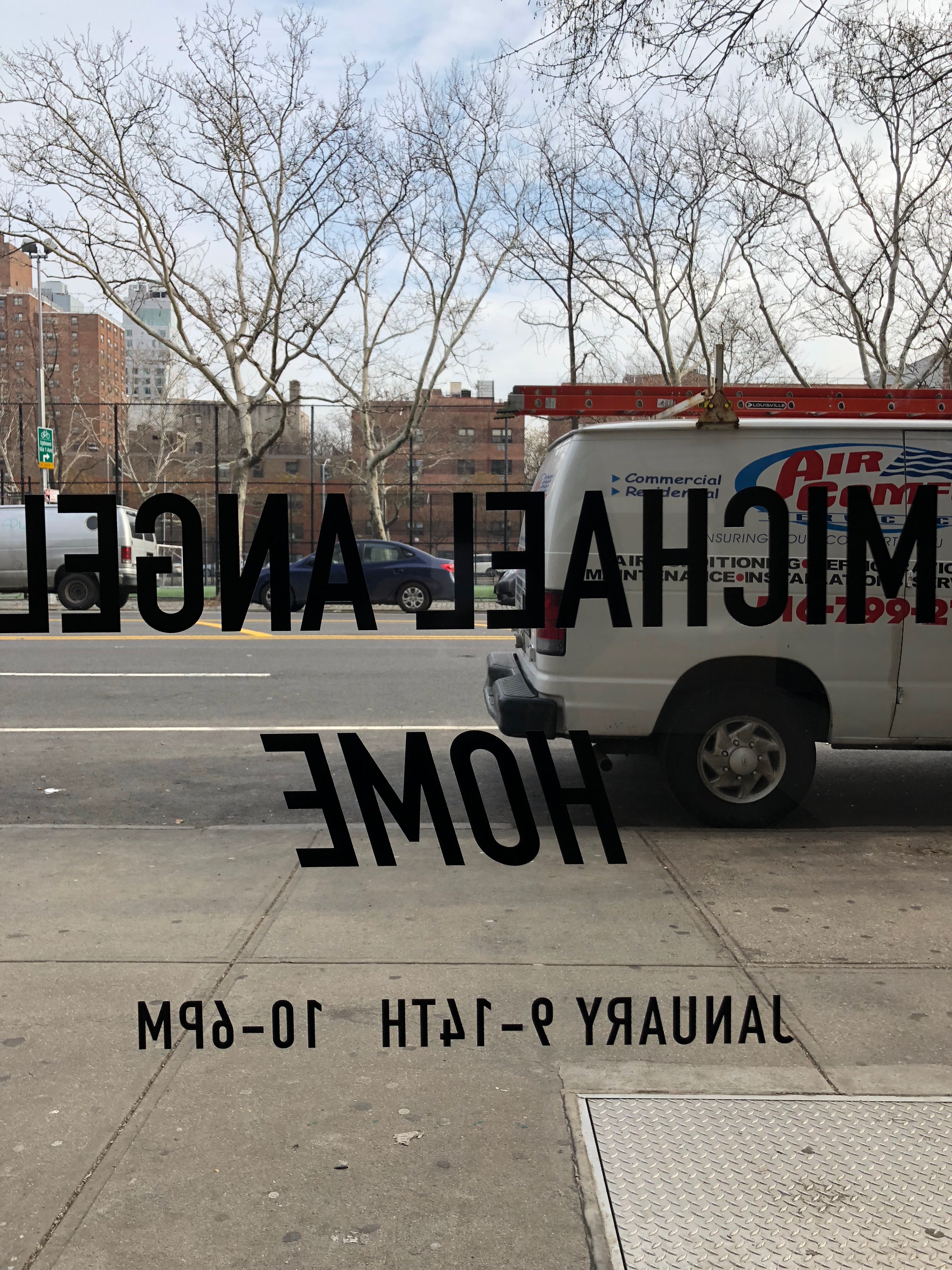
Michael Angel, Home, 2018
Gobbi Fine Art LLC
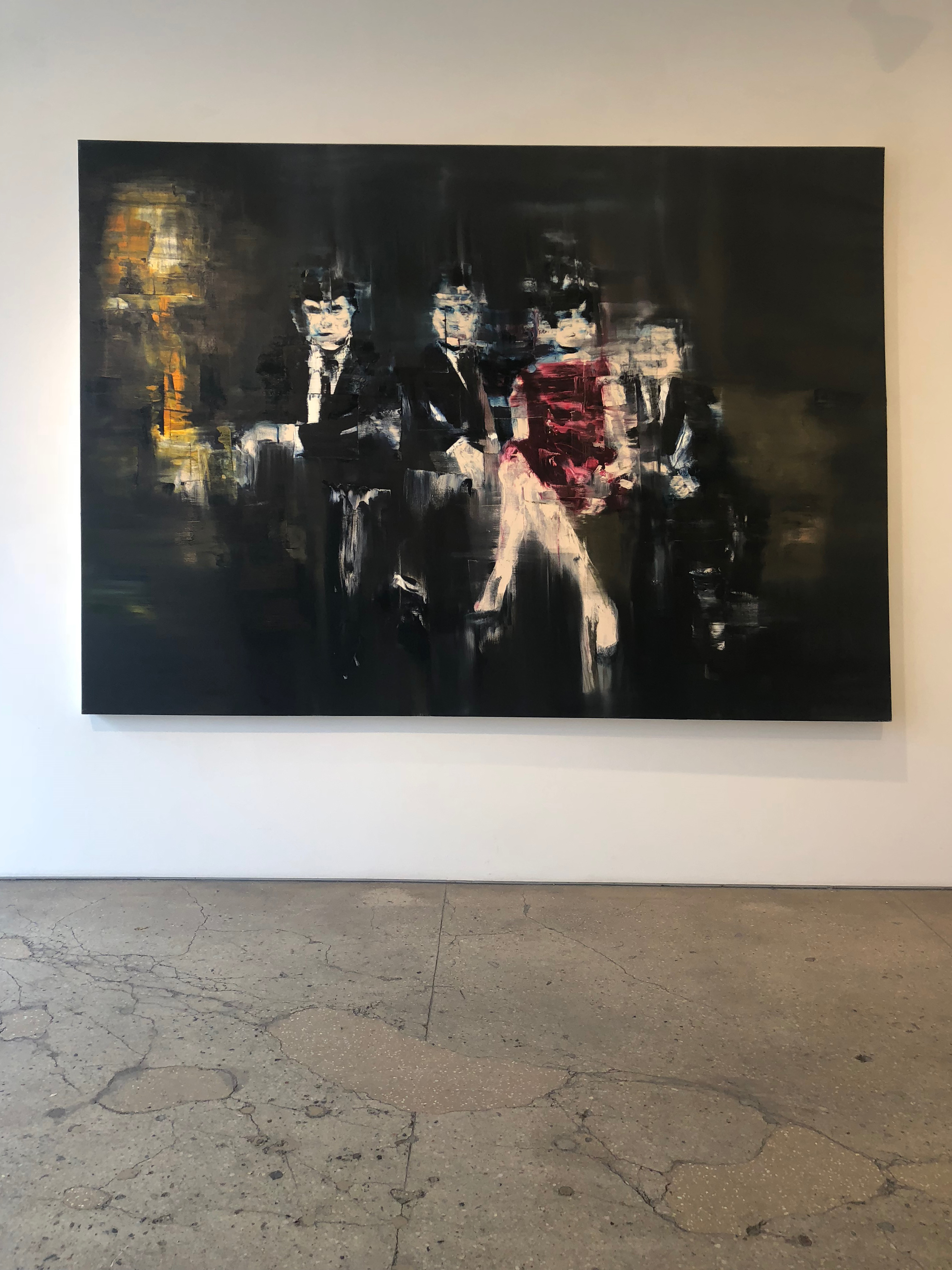
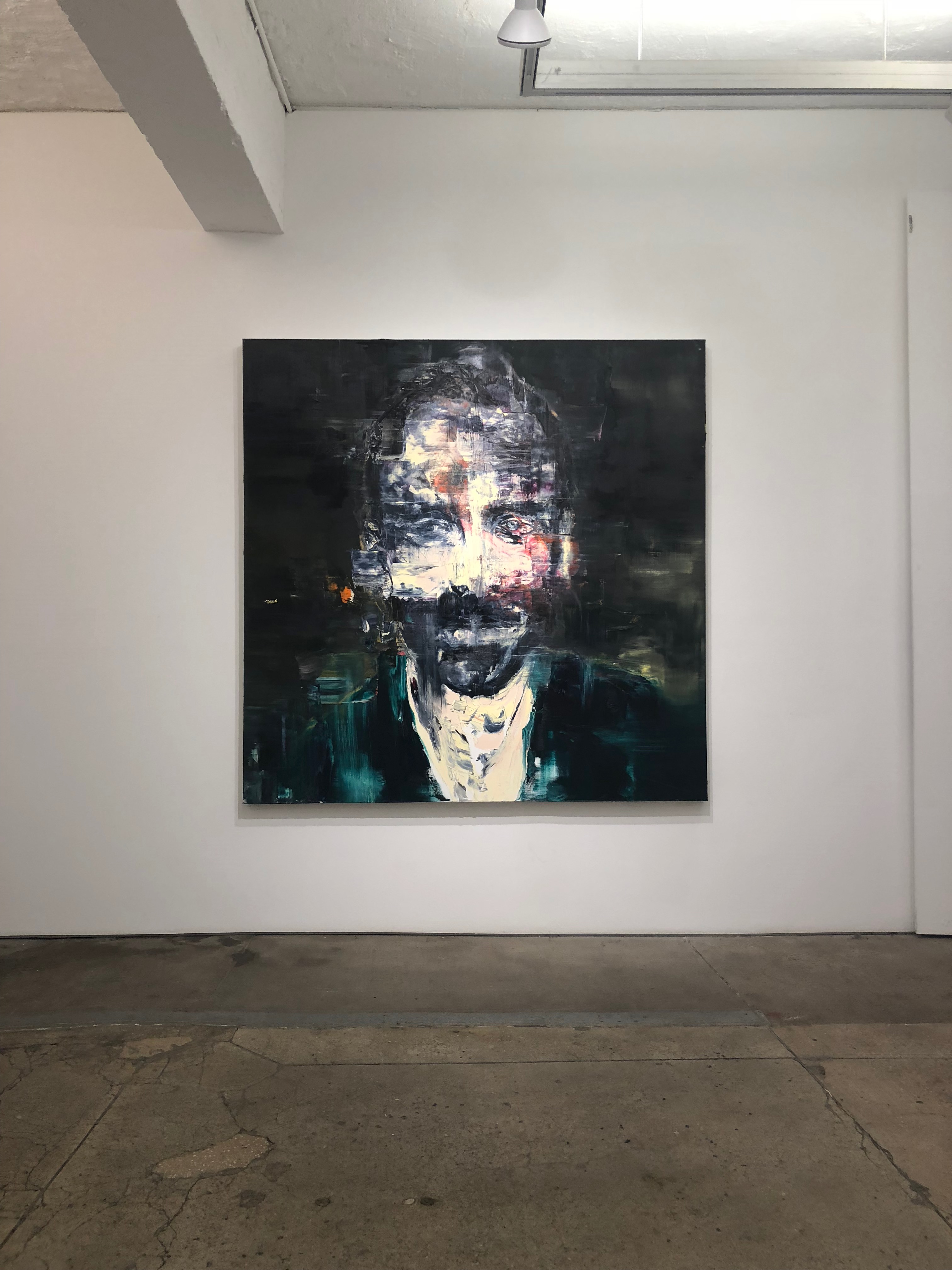
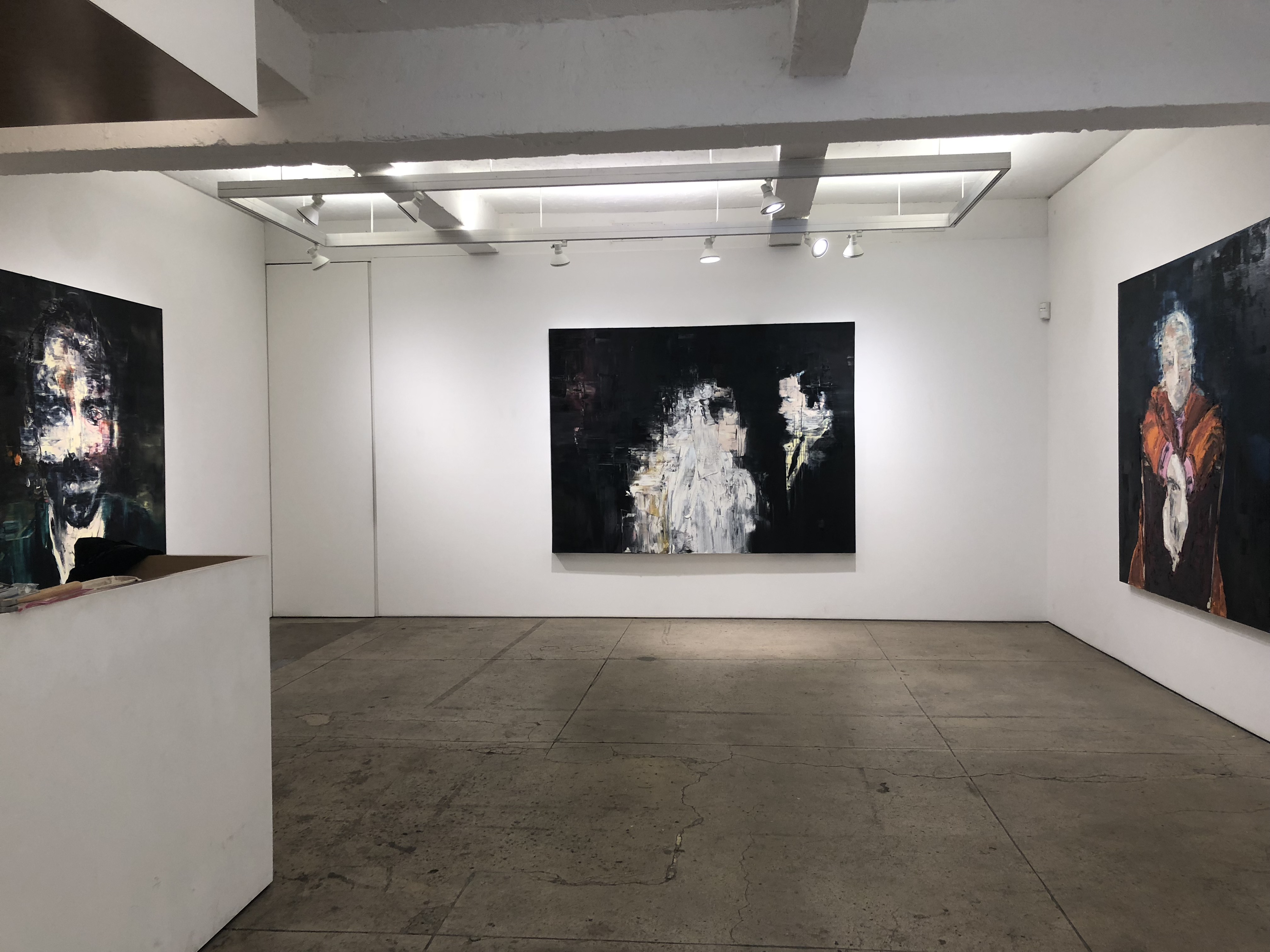
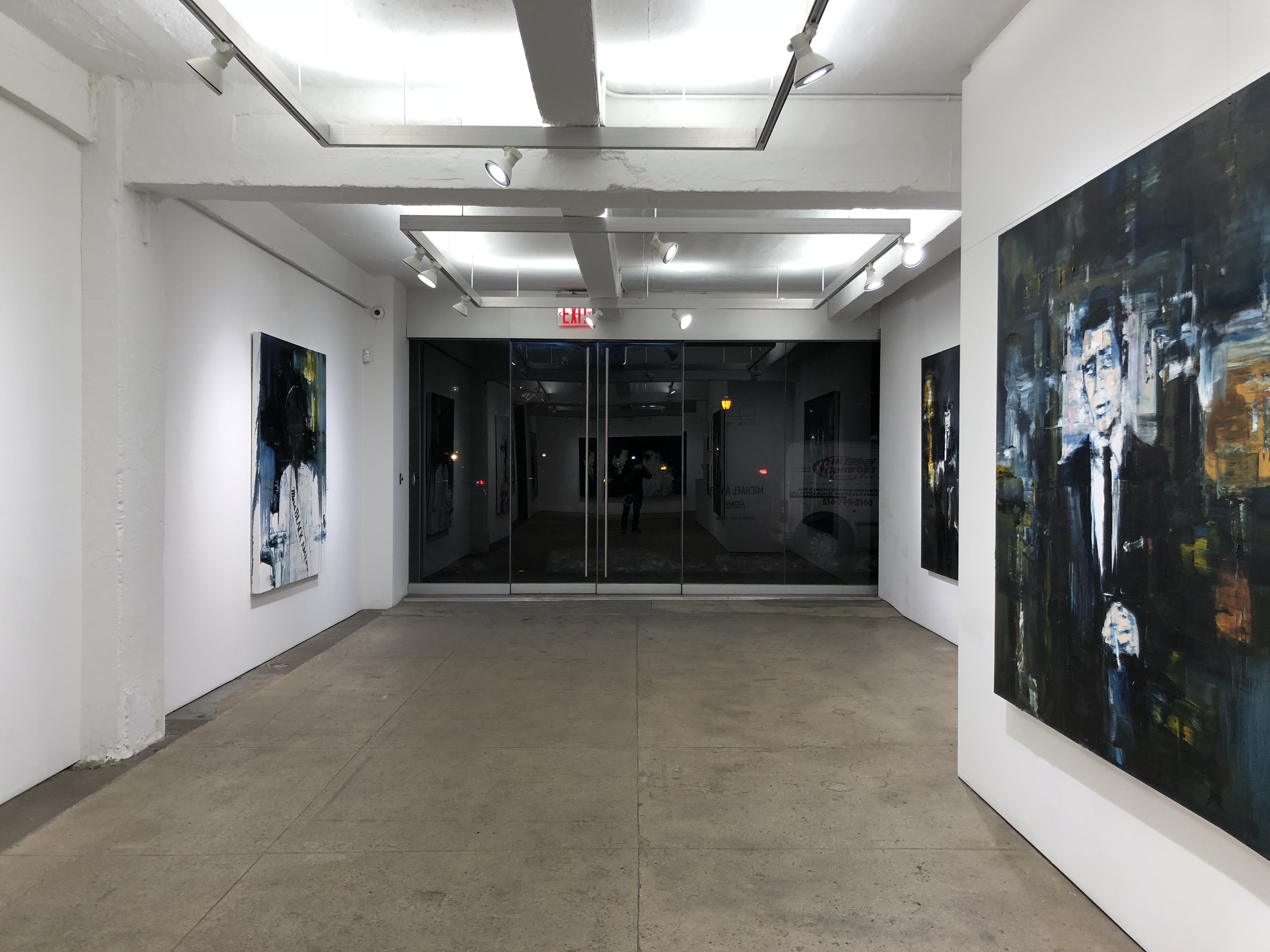
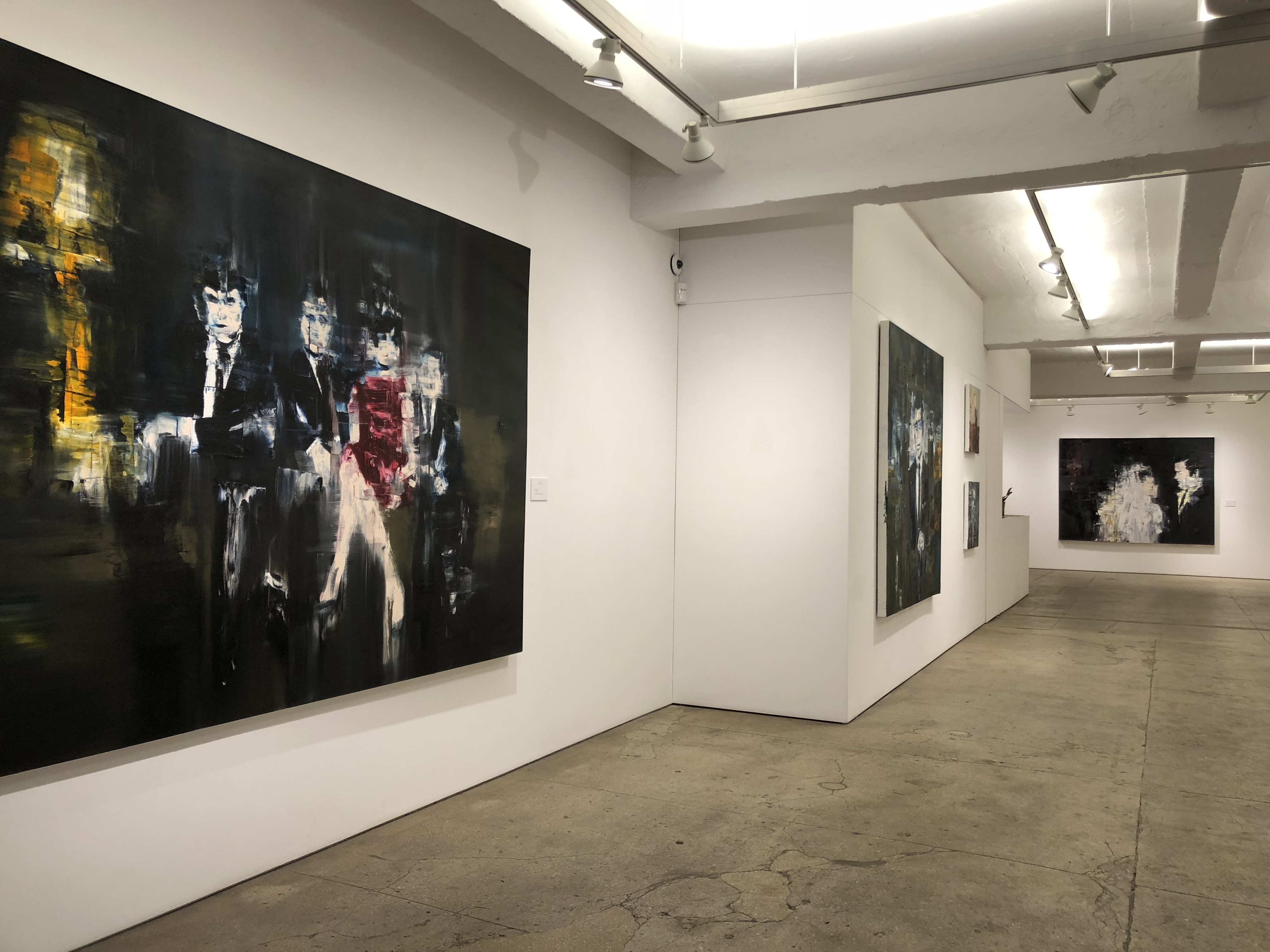
If you’re looking for America you won’t find it here. Despite the “home” of the series’s title — Michael Angel has called New York home for sixteen years — there is something dislocating about the images in this show. This sense of being unmoored is due not merely to the veiling effect of Angel’s palette knife technique, developed in earlier series to the point of total abstraction. While his methodical scraping of the canvas does serve to obscure and distort the figures by means of a distancing, screen-like grid that recalls his earlier work at the forefront of digital textile design, it is the figures themselves that do not easily settle into a narrative of comforting domesticity. Neither do they serve to orient the author for us by naming and describing his point of origin.
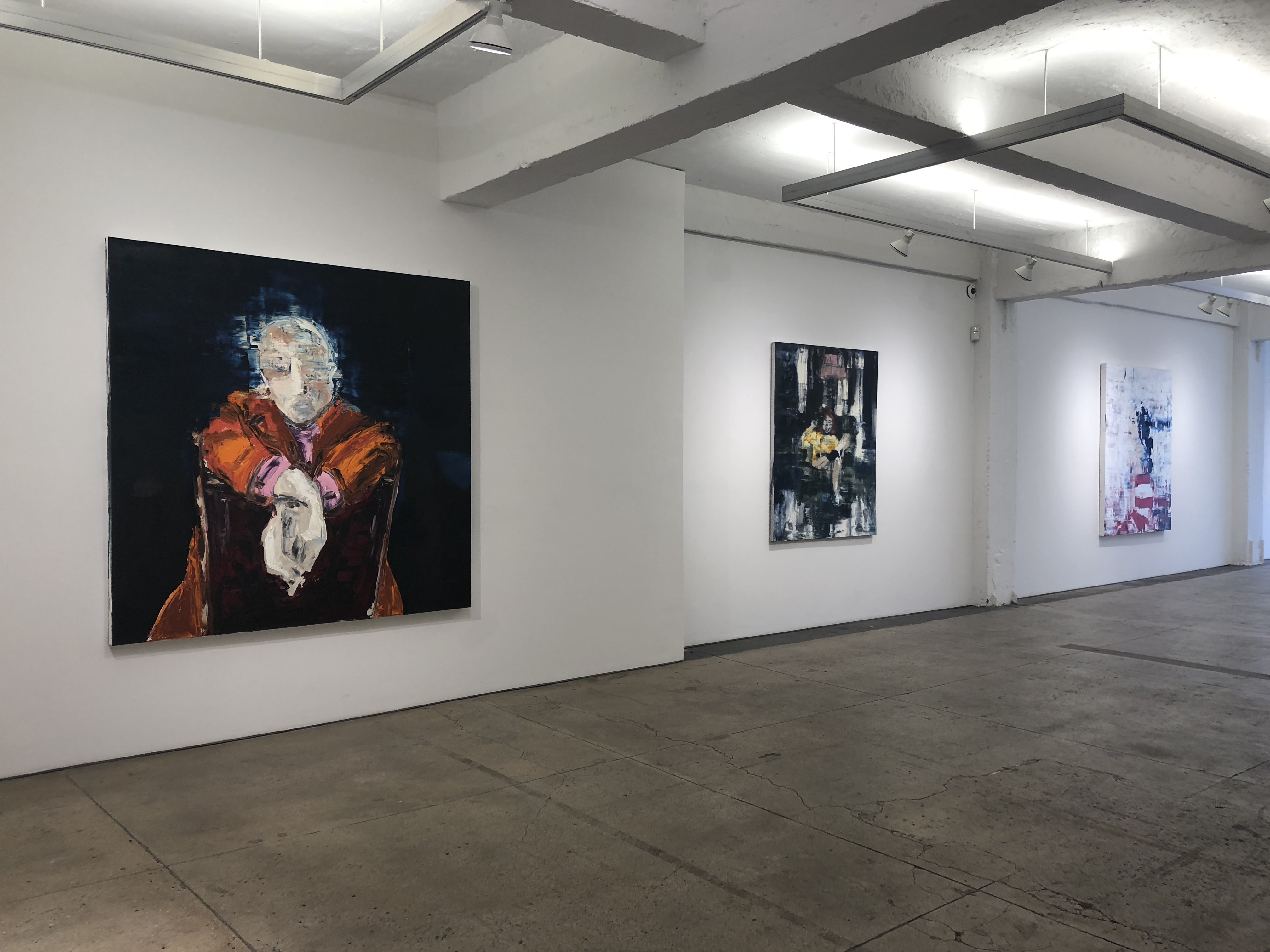
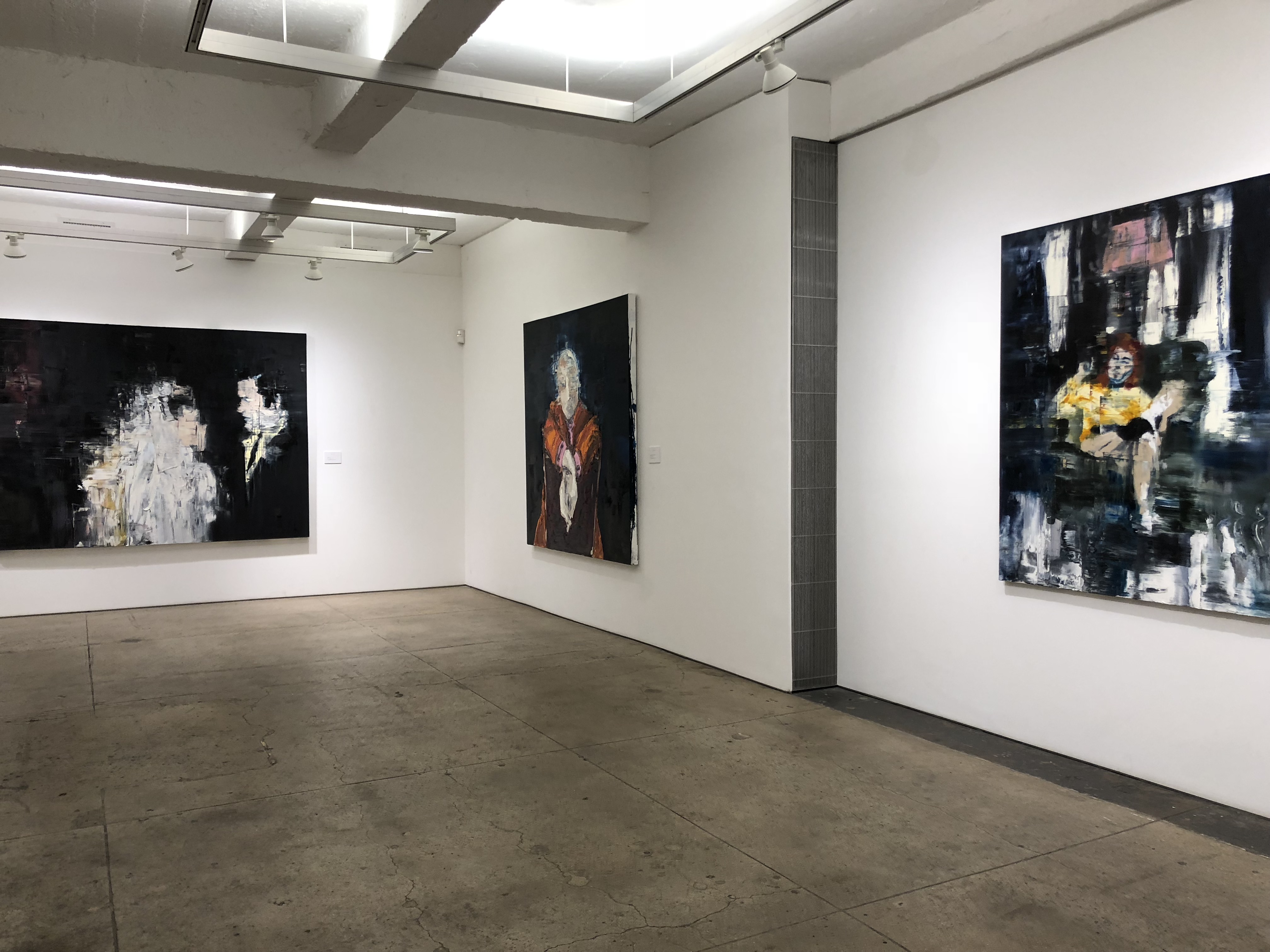
There are, at first glance, some of the trappings of domesticity. The Smoker, for example, sits in a club chair in front of a bright pink floor lamp with the suggestion of light filtering through curtains behind her. Leaning back with her legs crossed at a wide angle, her casual posture suggests comfort and spatial ownership. Her posture could, I suppose, be read as aggressive, though what unsettles this image for me is the destabilizing space that she floats in. I say ‘float’ because as the scraping of the painting’s surface shifts from vertical in the top half of the canvas to horizontal at the bottom, it takes on a watery effect, like an image reflected in the surface of a dark lake or cutting out momentarily in a live feed.
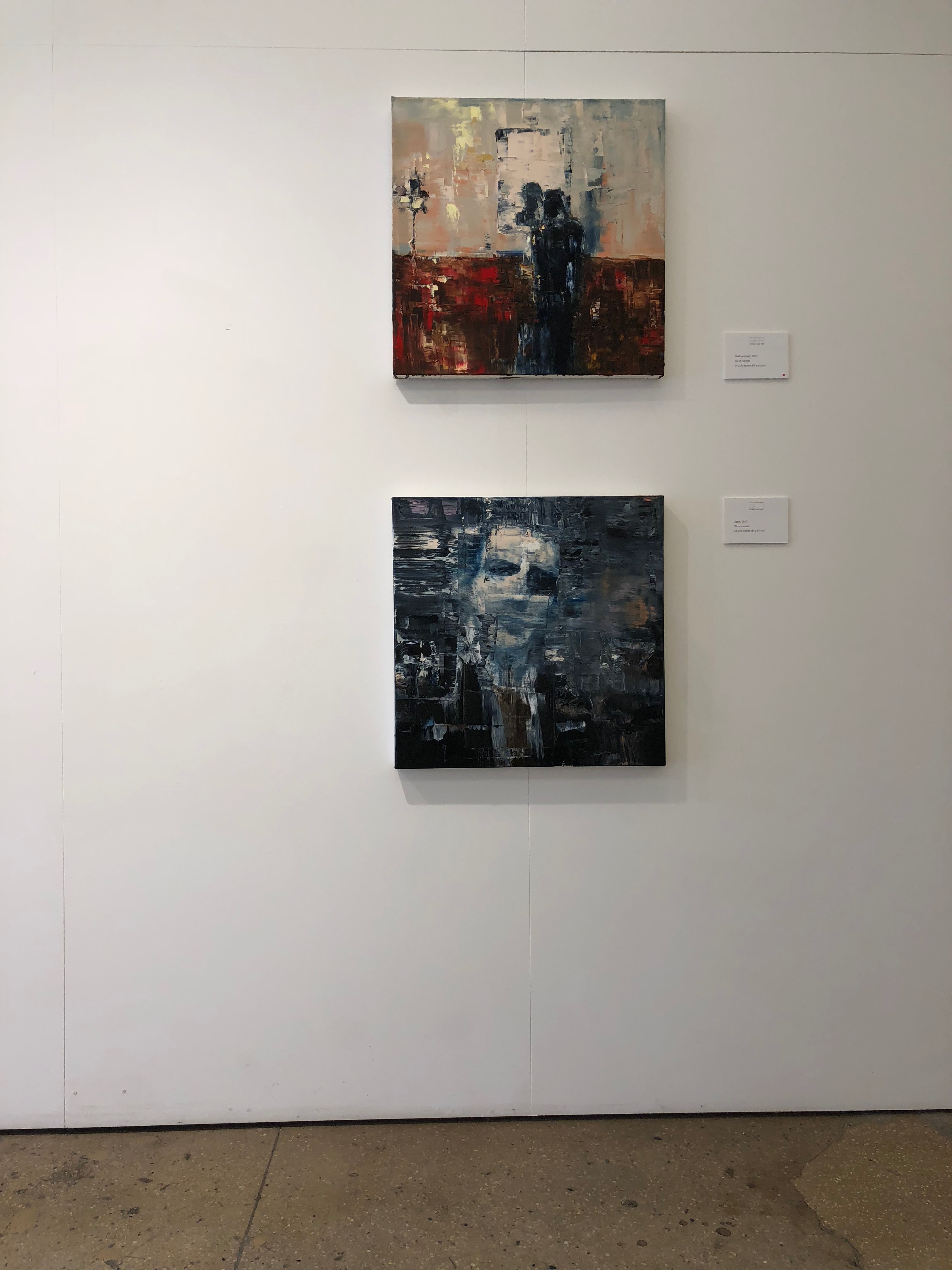
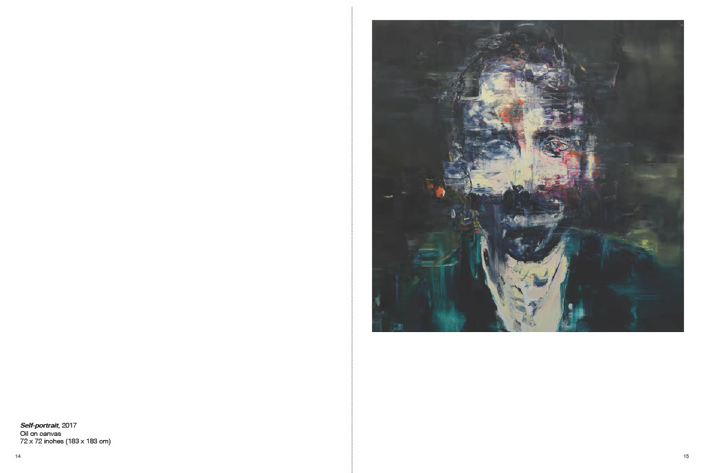
All of Angel’s images from this series have the feel of home as it is revealed through a dark medium. One does not get the sense that these are casual, but rather highly constructed, even guarded, images. His Untitled painting of four figures perched on a sofa suggests an outward-facing image of a family, whose interpersonal relationships remain obscure behind a posturing propriety. While certain of his figures are painted from life, his Self-Portraitfor instance, the majority begin from photographs. Here his personal family photos, like the image of his parents on their wedding day, mingle with found private and commercial images, all dating approximately to the 1960s. Born in Melbourne in 1975, Angel’s contact with the 1960s has come primarily through historical media, whether television reruns from his youth or images encountered much later as an adult.
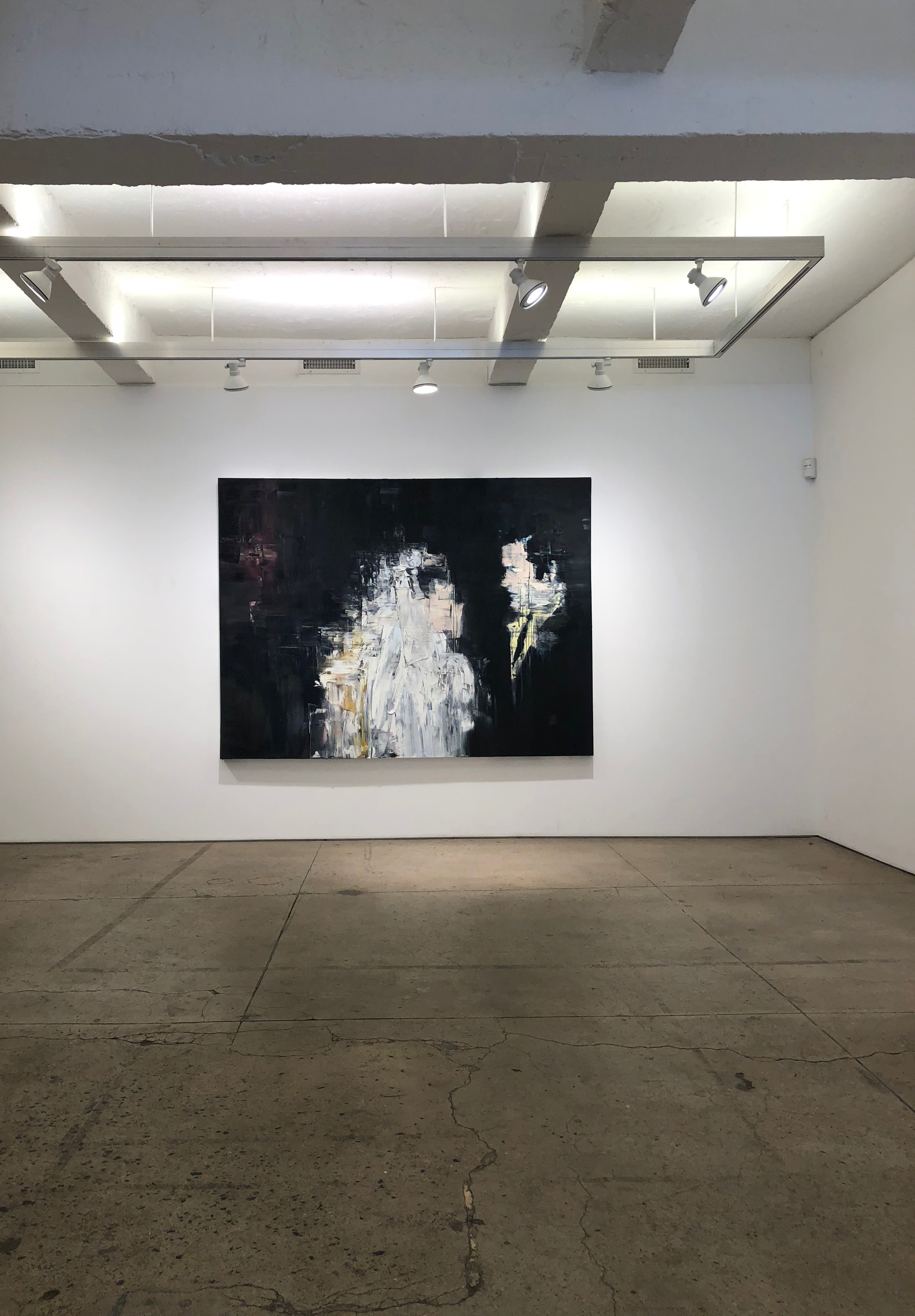
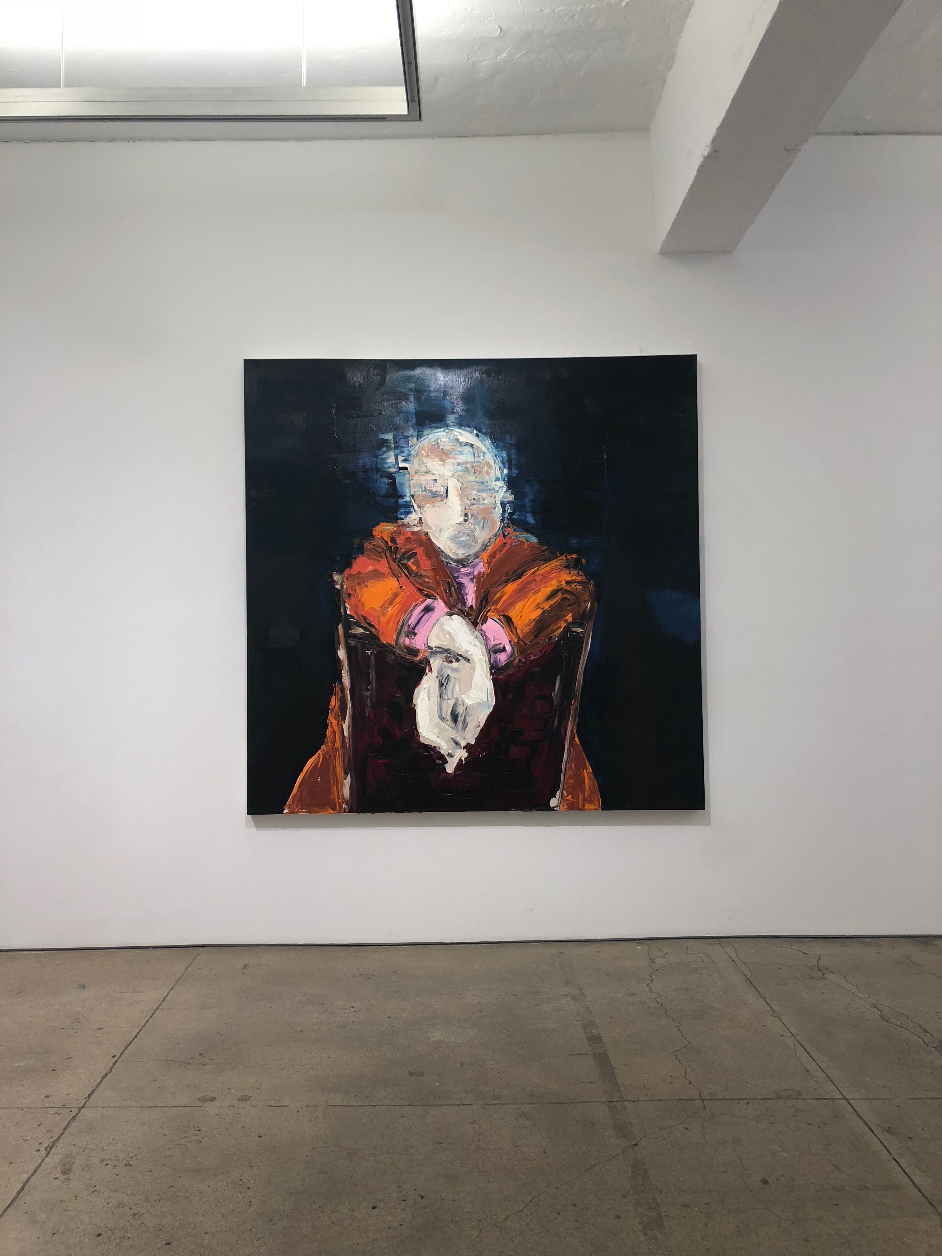
One cannot help but notice the curious combination of patriarchal authority and Americana that pervades Angel’s source material. The figure of his father in 1969 has a clearly defined profile, while his bride’s face is fully obscured, even with her veil pulled back. Meanwhile, the formless shape hovering behind them (a crucifix perhaps?) creates an ominous presence in what should be a celebratory image. The solitary figure in Untitled II, with his black suit and casual cigarette is the archetypal authoritative man. It calls up the “organization man” who populated the 1950s American imagination, a version of our modern day “men in black,” but its personification of institutional and state authority can also be traced as far back as Max Beckmann’s Self-Portrait in Tuxedo (1927). The source photograph is in fact Rod Serling, host and creator of The Twilight Zone (1959-1964), which Angel would likely have watched with his own father in the 1980s. Likewise, the obscured visage of Saul Bellow in The Conversation manages to communicate, through his power posing and bold color scheme, the self-assuredness of the authorial voice.
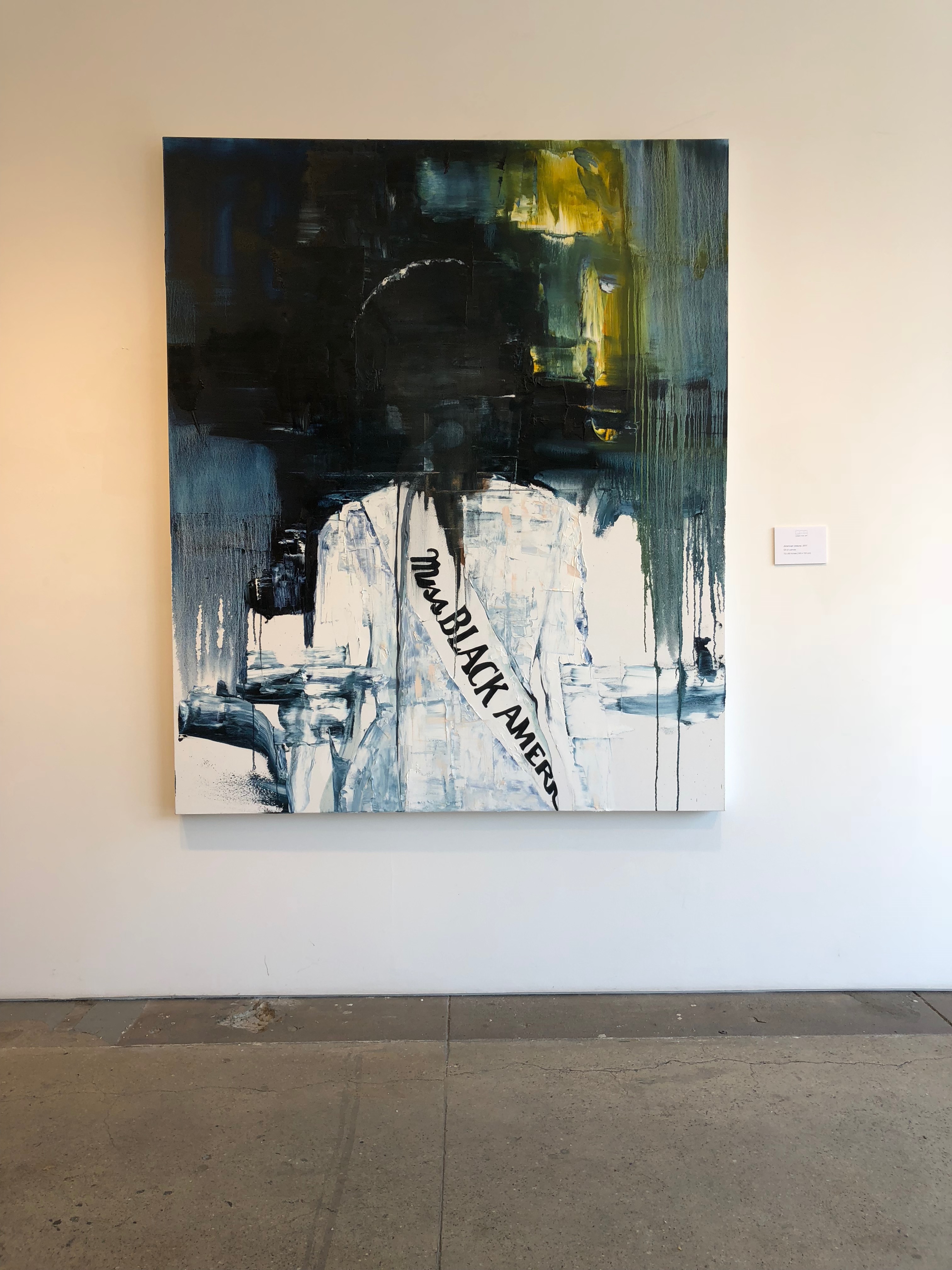
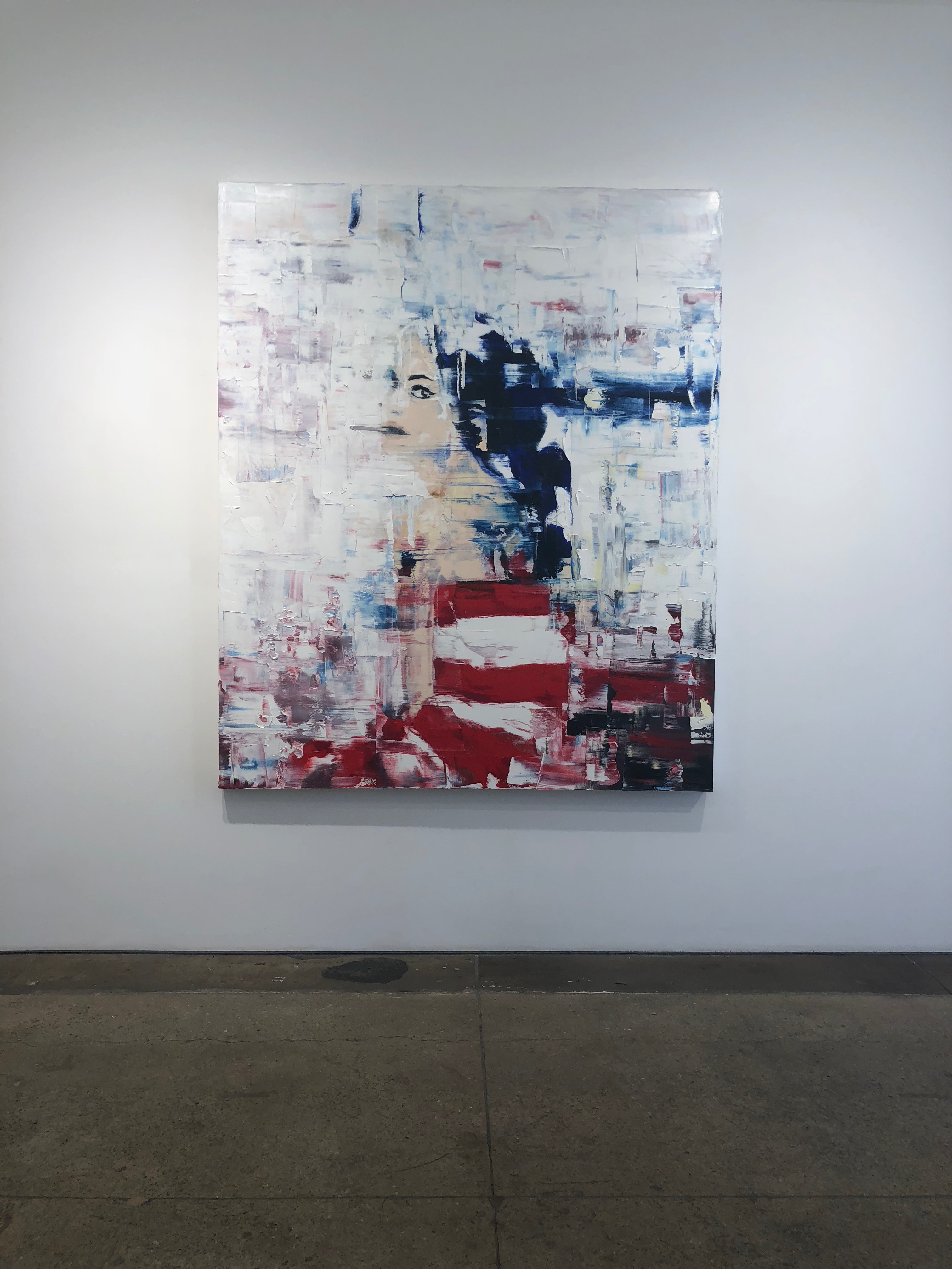
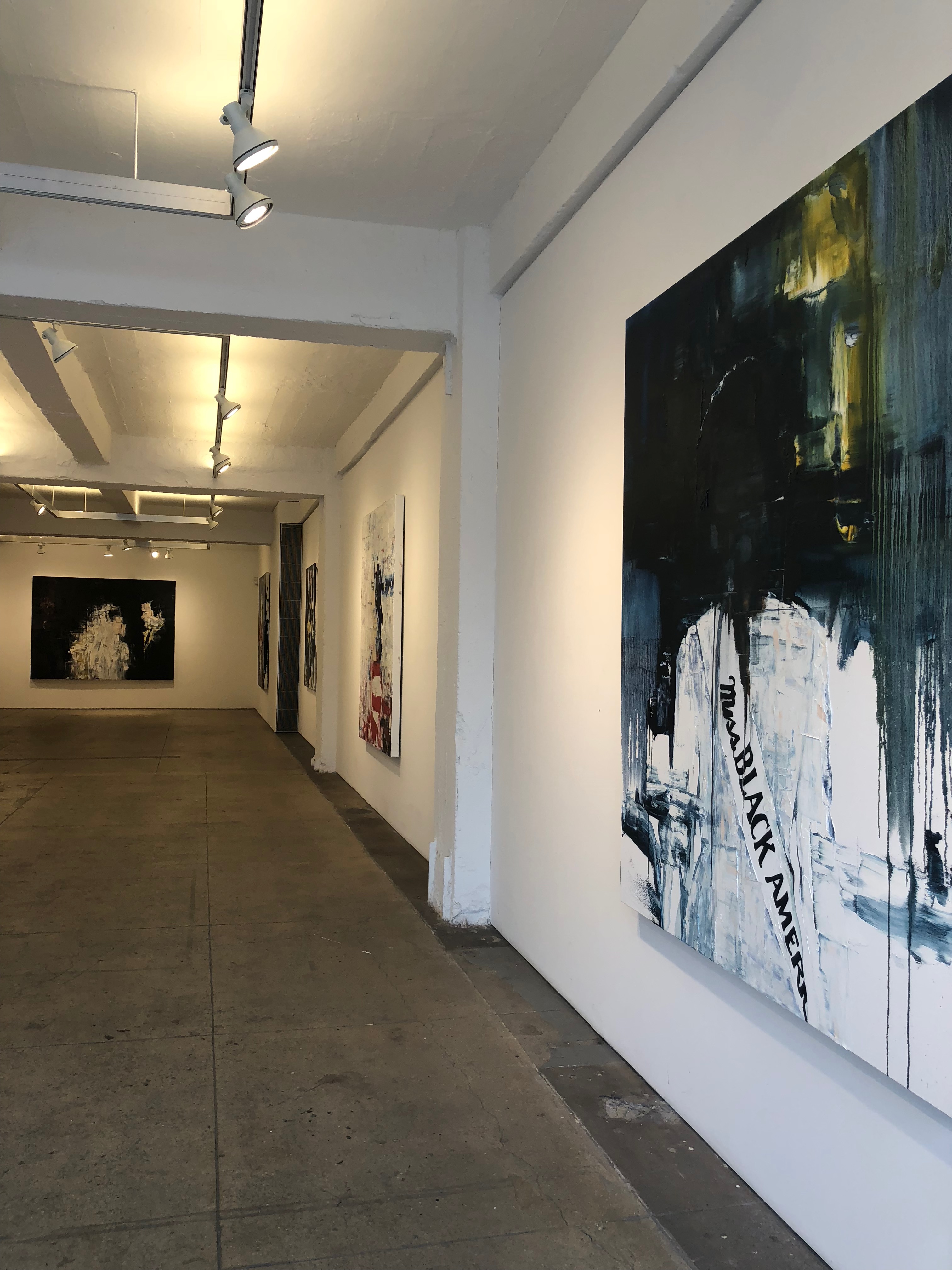
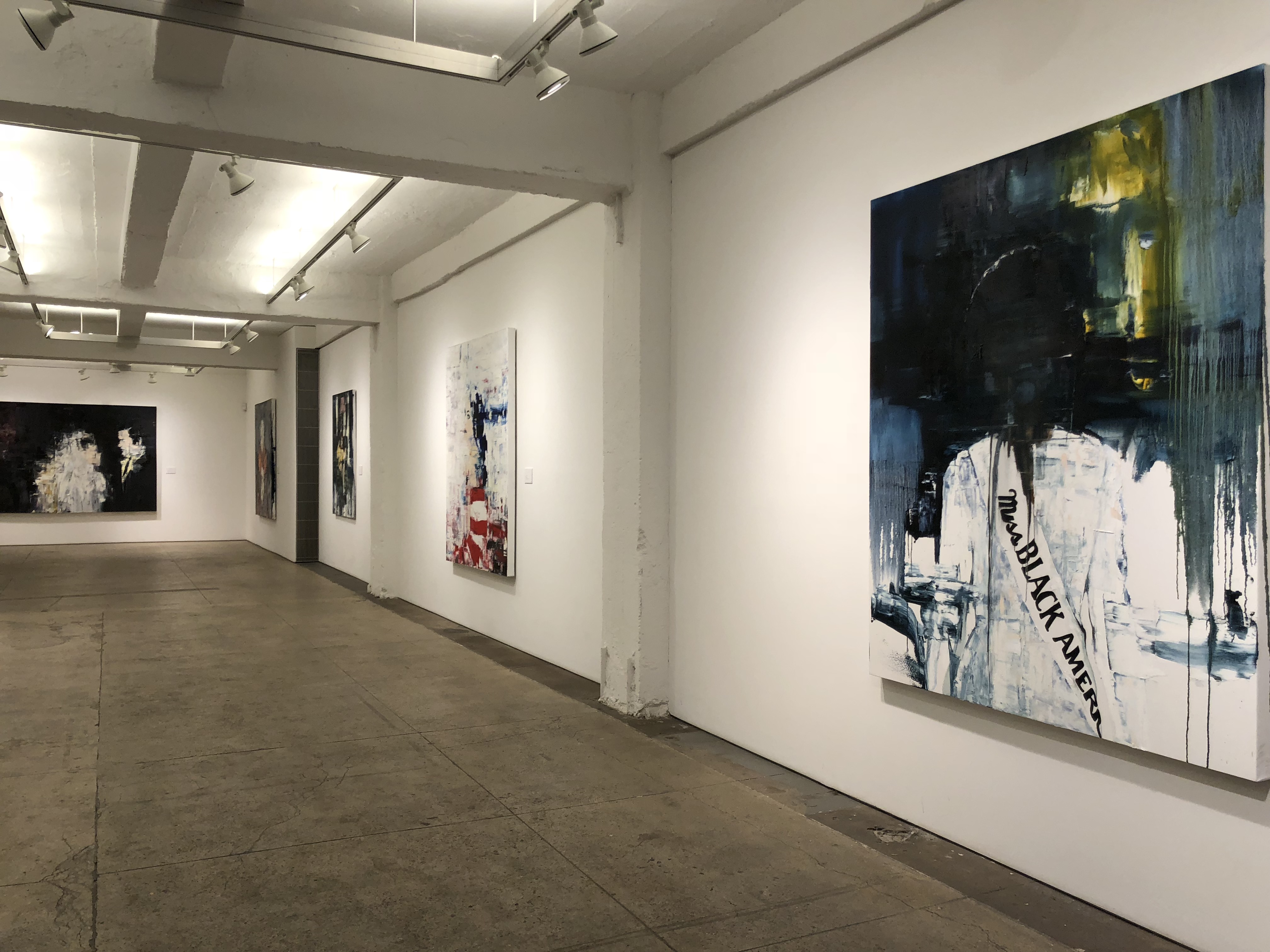
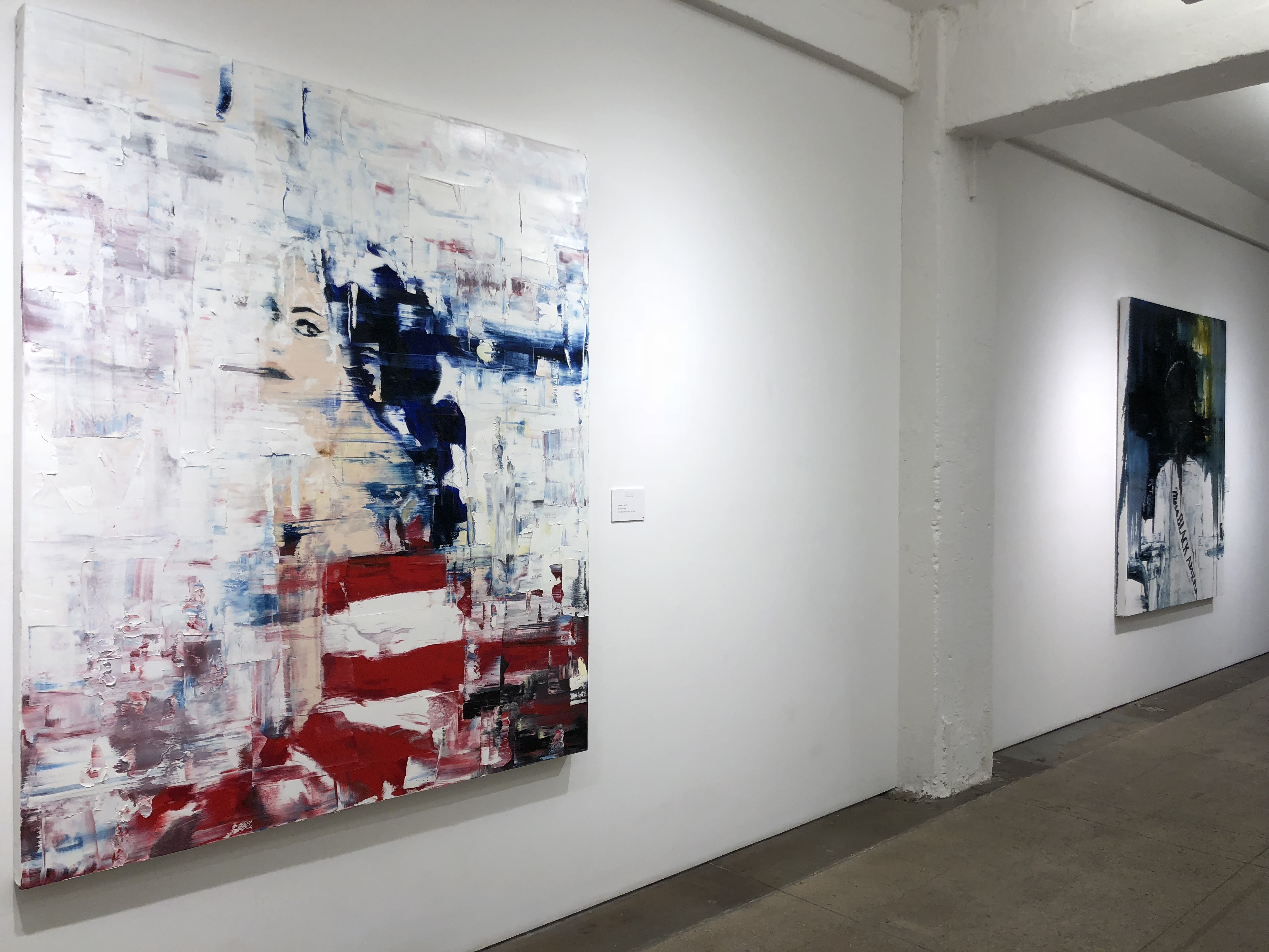
The themes of the series culminate in American Beauty and Untitled, which serve as pendants to one another. Both draw from appropriated photographs, one of Gloria O. Smith, the second titleholder of Miss Black America, taken in 1969, and one from an advertisement for White Owl Cigars published in 1965. How are we to understand these images in a series called “Home”? Each presents the viewer with an image of female beauty as an expression of nationhood, though they simultaneously express the power structures that control these deployments of national identity. Miss Black America was started in 1968 in protest against the whiteness of the mainstream Miss America pageant and normative beauty standards that excluded black women. The painting is half covered in a darkness that bifurcates the canvas diagonally, shrouding Smith’s features, except for a few highlights in her hair and earrings, as though splitting the difference between the spotlight she enjoys as a pageant winner and her relative obscurity within American popular culture. In Untitled,a white woman (in the source image, the model Angela Howard) wrapped in the American flag sits bathed in a blindingly white light that encroaches on her face as a series of taches. The contours of her face are lost in the glare except for her heavily lined brows and eyelids. On the one hand, she enjoys a cultural visibility that American Beauty does not. On the other, her passive sexed-up patriotism is hardly liberating; she cannot compete with the self-possession of Smith. Instead she longs for the veneer of authority: “If I were a man,” the original ad copy reads, “I’d smoke White Owl miniatures.”
Much as Angel’s images of family life suggest their orchestration for the outside world, these are not candid images of American life. They are not, for example, those that Robert Frank captured when he visited the segregated America in which these two final source images were made. Instead, Angel’s paintings capture the distance –temporal and emotional – encoded in the originals and bring out the unhomely aspects of experiencing America as home.
Written by Dr. Melissa Ragain











Series 1
[2014]
Series 1 [2014] World Trage Gallery , New York
Exhibition Content
[2014]
Opening reception: November 20th 2014
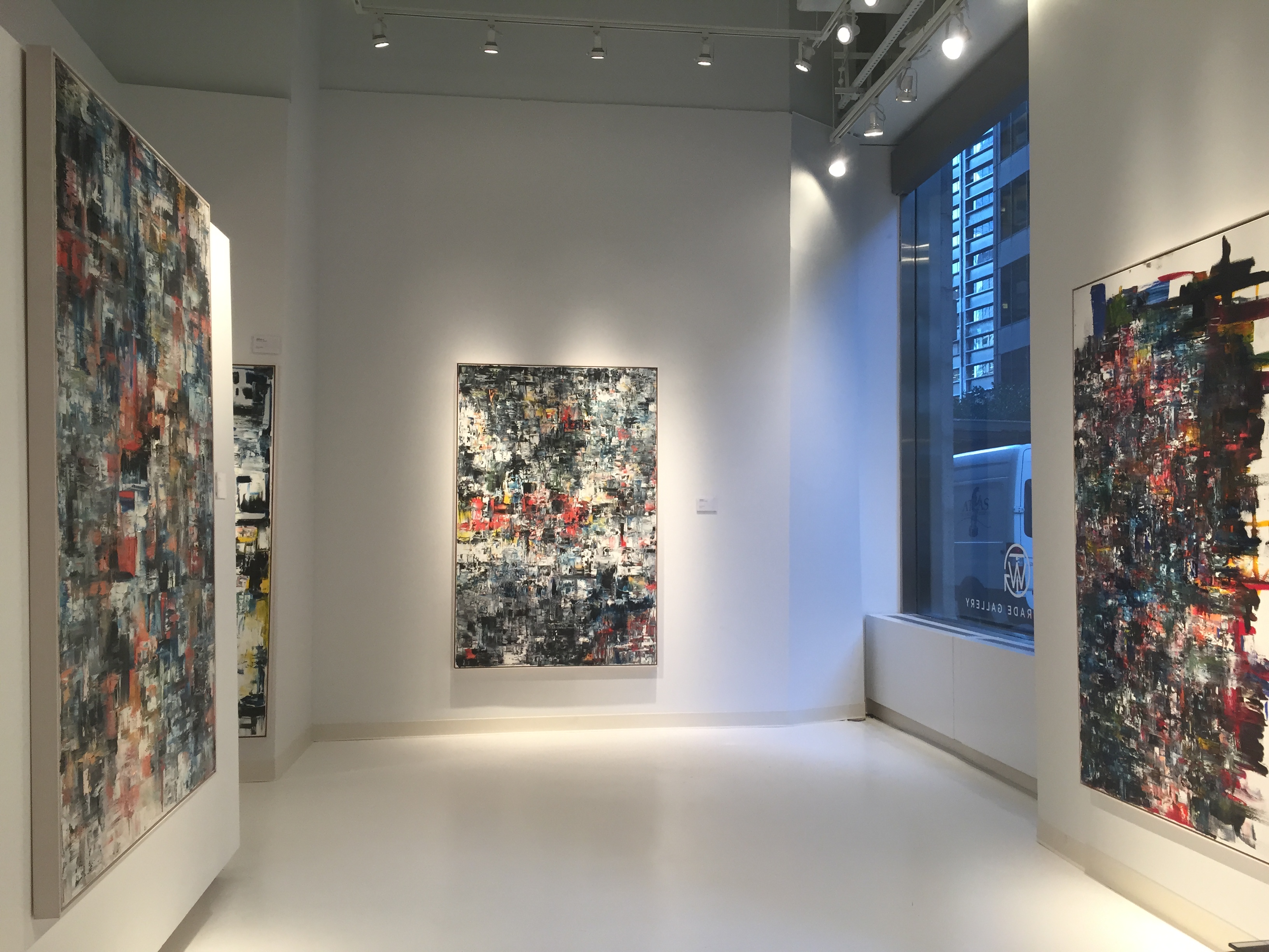
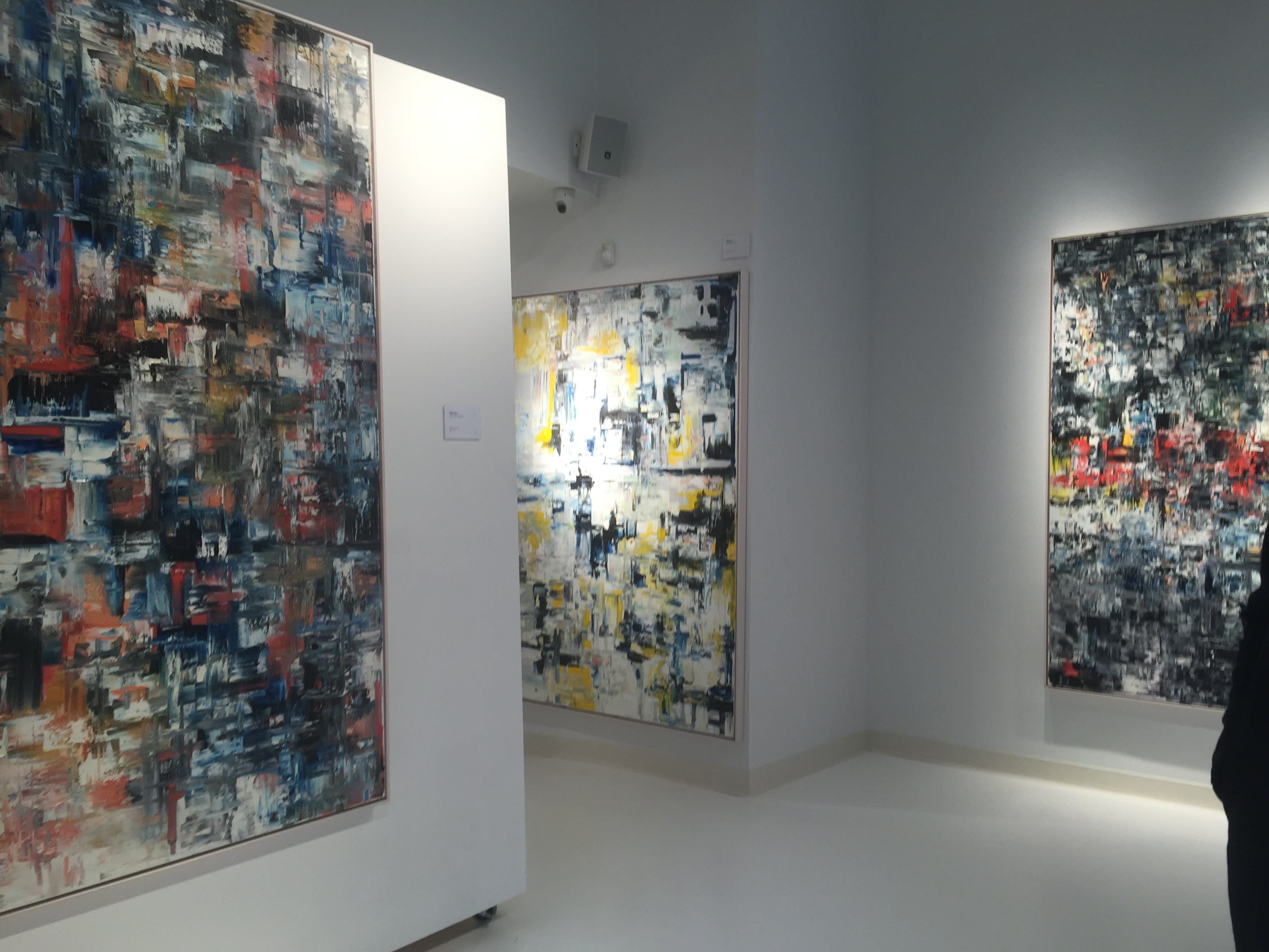
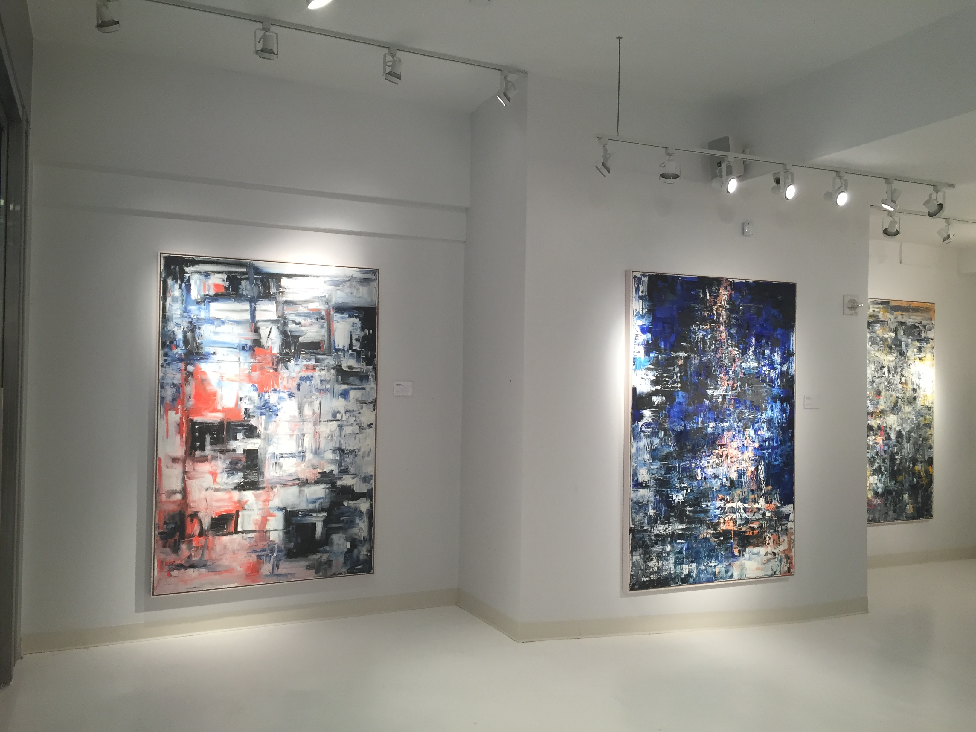
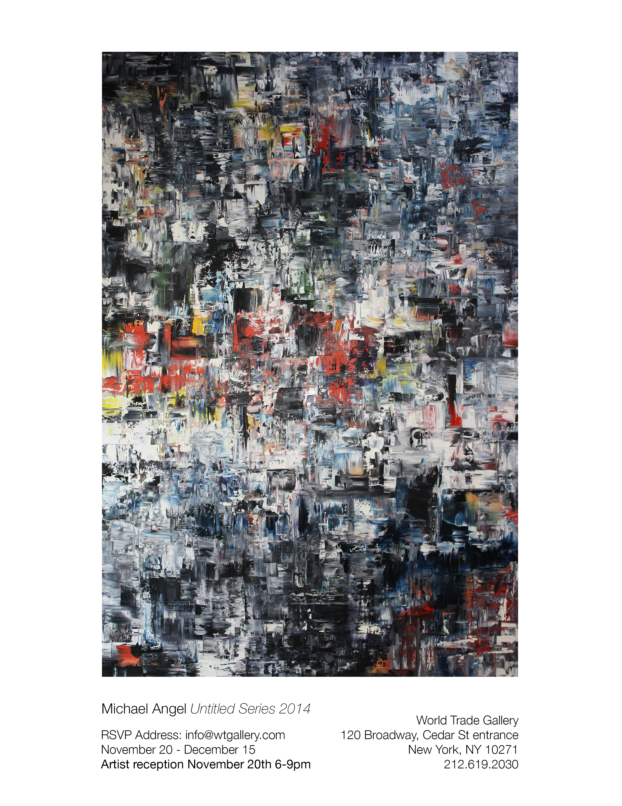
World Trade Gallery is pleased to present a series of new works by New York- based artist Michael Angel, which, following a noted and innovative practice in digital print design, marks a return to painting, and his first solo exhibition in the city.
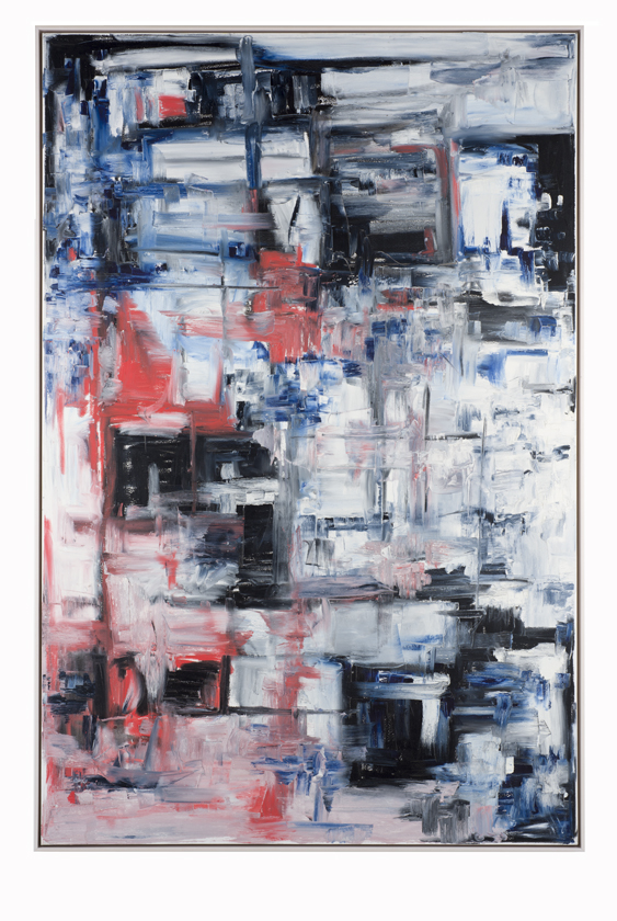
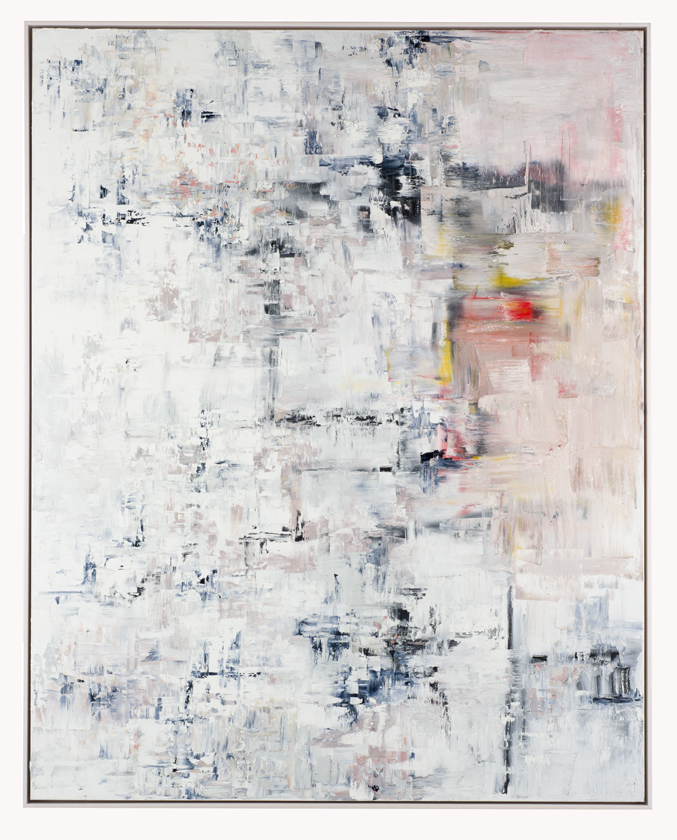
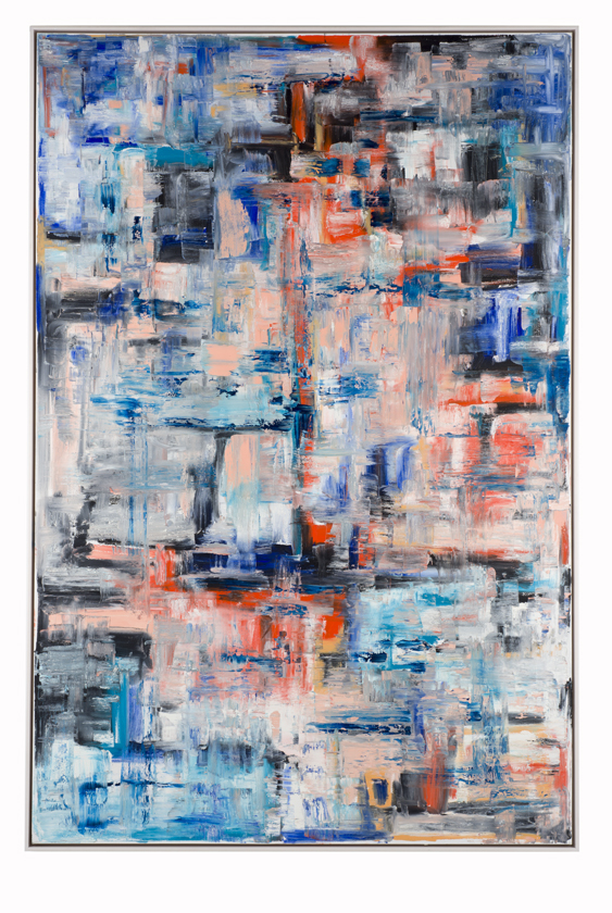
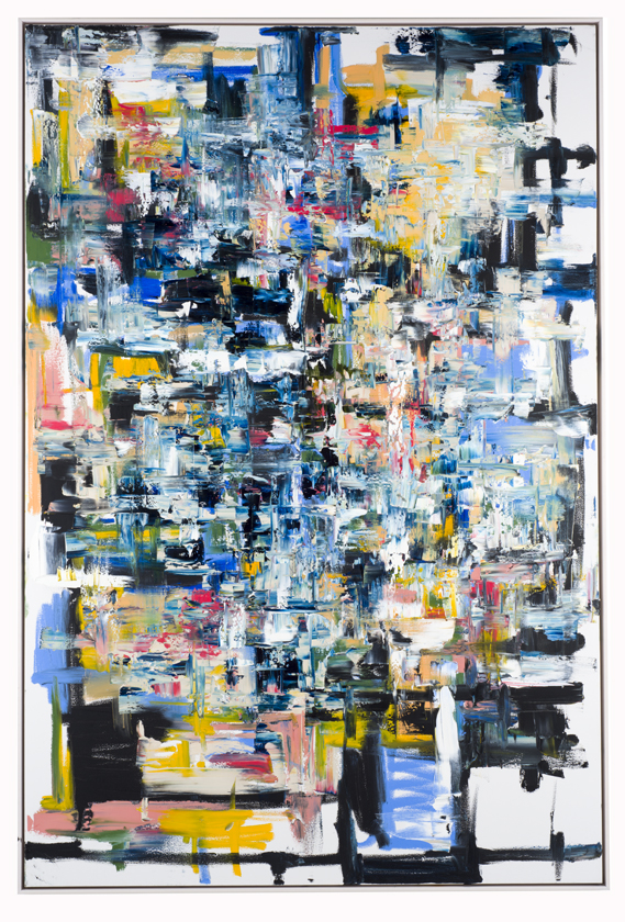
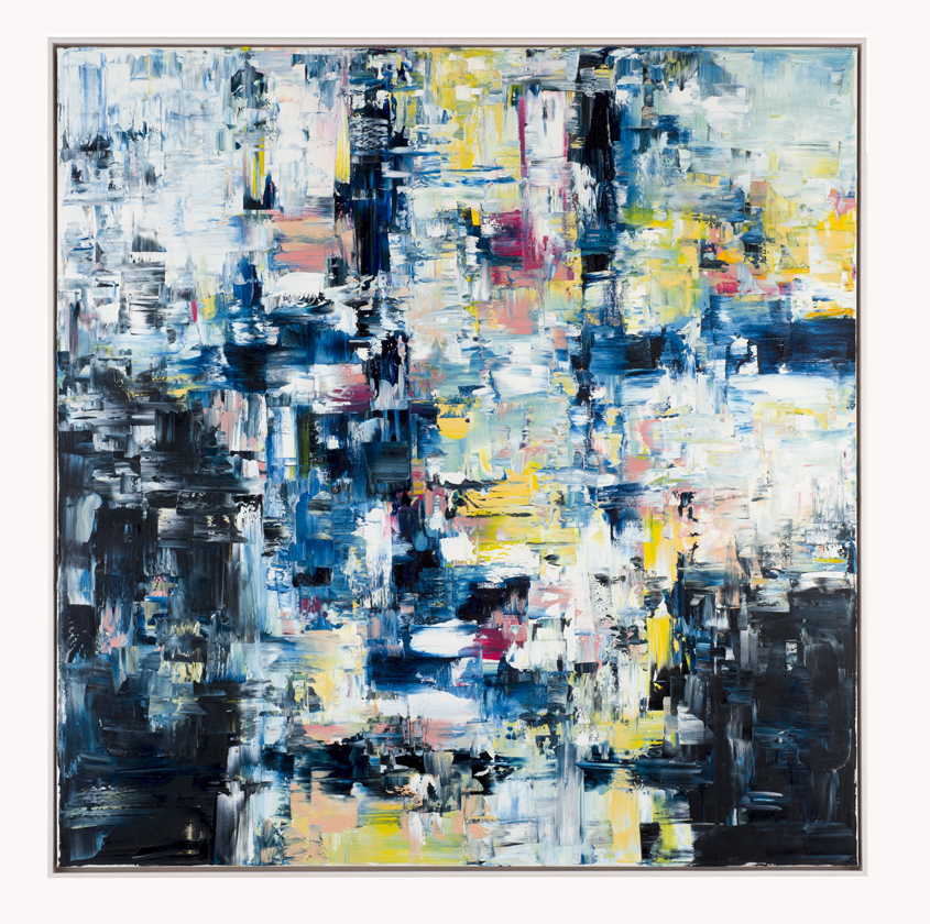
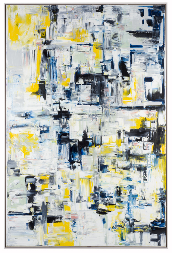
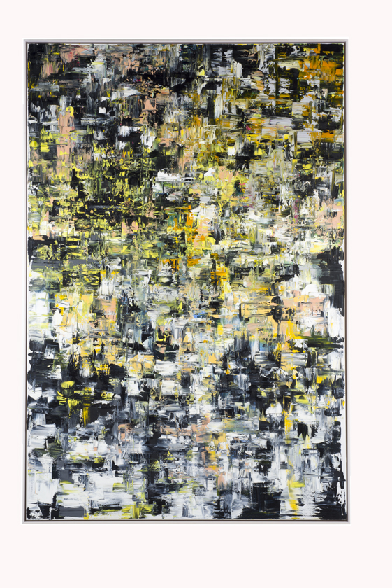
Colorful, but with a palette that is offset by a persistent use of blacks, navies and whites, highly textured, but with a dimensionality that is brought into relief by deliberate patches of smooth and flat, the 15 oils on show all exhibit Angel’s earnest and expressive knife-work. Here, the manual painterly gesture is on full display, peppered throughout with moments of seeming pixilation, perhaps an artifact of, or homage to, the artist’s years of working with digital techniques. The series as a whole, of course, recalls the tradition of post-war abstract painting, though absent is any of the contemporary anxiety about the condition of the medium in an art world now happy to dub a print or a cast a “painting.” This is not to suggest that Angel’s work is nostalgic or even retrospective, but only that Angel himself is primarily concerned with the business of putting paint to canvas and saves talking about it for later.
Of his abstractions, Angel is refreshingly guileless: once a painting is completed he has no unease at identifying a figure here, a memory there.
In Untitled 8, for instance, he remarks that he often sees “a girl in a chair,” and that this sometimes serves as his own private title for the work. Elsewhere in Untitled 10, “looking up at you” comes to mind. As for their public presentation, the works remain untitled, and Angel keeps at
an inquisitive remove from the viewer’s choice to see, or not see, whatever he will.
